Returning to Scrapbooking: A Taco Fiesta Celebration

Returning to Scrapbooking with a Special Family Celebration

Returning to scrapbooking wasn't something I had planned.  Like many crafters, I tend to focus on whatever creative hobby has my attention at the moment, and for years that has been predominantly cardmaking. 
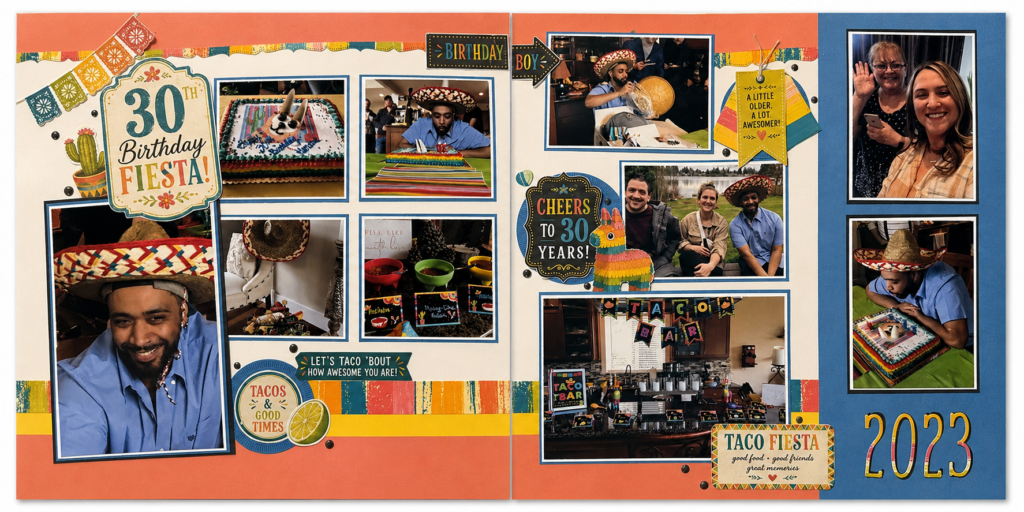
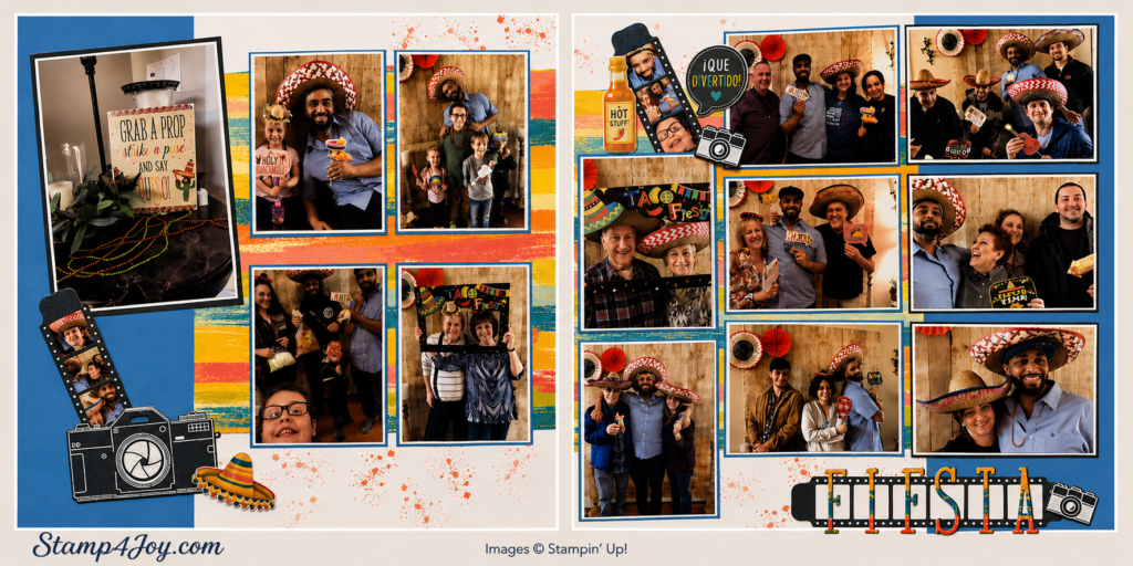
Returning to Scrapbooking layout 1 - Stamp4Joy.com
30th Birthday layout 2 - Stamp4Joy.com

But recently I found myself pulling out some old photos and decided it was finally time to preserve the memories from my son's surprise Taco Fiesta 30th birthday party.

Looking through the pictures brought back so many wonderful memories.  Family and friends gathered

together to celebrate his milestone birthday, complete with tacos & margaritas, colorful decorations, a photo booth, and plenty of laughter.  It seemed like the perfect event to document as I eased my way back into scrapbooking.

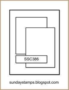
To help get started, I pulled out one of the Creative Design Team's sketchbooks and selected a layout sketch that I wanted to use.  Just like cardmaking, having a basic plan makes it much easier to begin.  As often happens, though, the pages evolved as I worked and ended up looking quite different from the original sketch.

Making the Fiesta Theme Come to Life

One challenge I ran into was finding embellishments that matched the Taco Fiesta theme.  Over the years my crafting supplies have changed quite a bit, and having recently moved I no longer had many stamps or other products that fit the occasion.

Rather than let that stop me, I simply printed some themed images and decorations to use throughout the layouts.  They helped capture the festive atmosphere and added just the right touch of color and personality.

I was also able to incorporate a few Stampin' Up! products into the pages.  The cameras and film strips from the Capturing Smiles Bundle worked perfectly with the photo booth pictures and helped reinforce the memory-keeping theme.  I also used numbers from a retired alphabet set to create the year on one of the layouts.

One of my favorite parts of the project was seeing all the bright fiesta colors come together.  The banners, sombreros, tacos, and cheerful embellishments helped tell the story of the celebration without overwhelming the photos themselves.

Learning as I Went

Of course, no scrapbook project is complete without a few unexpected surprises.

I actually had several more photos I wanted to include.  My plan was to use flip flaps so viewers could lift and discover additional pictures from the party.  Unfortunately, after I layered and matted the photos, I realized they had become too large for the flip flaps I intended to use. 🙁

At that point I had to make a decision.  I could redesign portions of the layouts or I could save those photos for another project.  In the end I chose to keep the pages as they were.  While it wasn't what I originally planned, the layouts felt balanced and complete, and sometimes knowing when to stop is part of the creative process.

Why Returning to Scrapbooking Was So Rewarding

One of the unexpected joys of returning to scrapbooking was rediscovering how much I enjoy telling a complete story across multiple pages.

Cardmaking will always be one of my favorite creative outlets, but scrapbook layouts allow me to preserve entire experiences.  Looking at these pages instantly brings back memories of the decorations, the food, the laughter, and all the people who helped make the day special.

The photos in these layouts were photographed inside their page protectors, so they aren't quite as crisp as the originals.  Even so, the memories shine through, and that's what matters most.

If you've been thinking about returning to scrapbooking, consider starting with a favorite family event or special occasion.  Begin with a sketch if it helps, use the supplies you already have, and don't worry about making everything perfect.  The goal is to preserve the stories that matter — and sometimes those stories are far too good to stay tucked away in a photo box.

If you don't think you're quite ready for full-on scrapbooking, pocket page scrapbooking is a great alternative!  And with the smaller 6″ x 8″ album and page size, it's easy to put together a quick holiday or special event album.
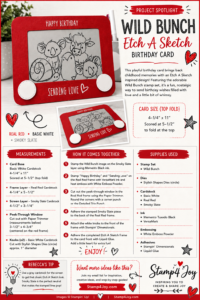
Wild Bunch Etch A Sketch Card

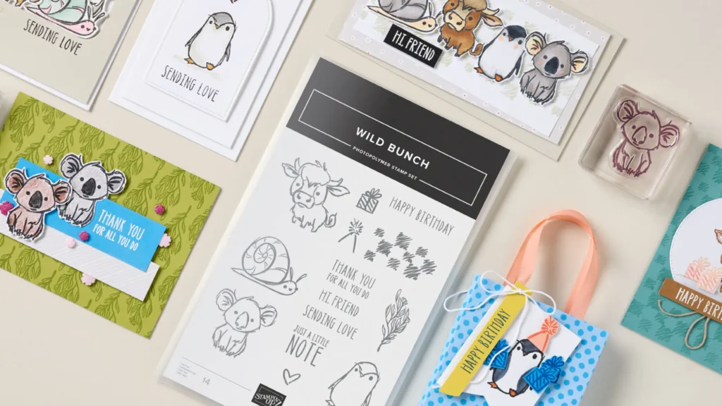
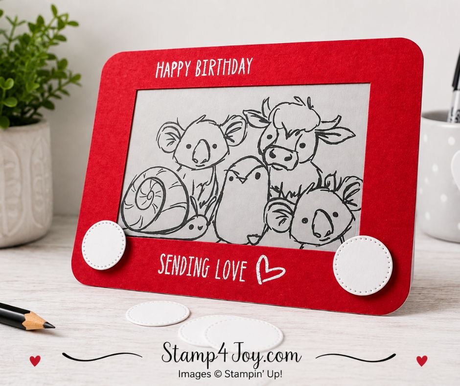
The Wild Bunch Etch A Sketch Card combines adorable animal images with a nostalgic design that is sure to make people smile.  Ever since I first saw the Wild Bunch stamp set I knew I wanted to recreate an Etch A Sketch inspired card I made years ago.  It took me a while to get around to it, but I finally did!

If you'd like to see the original inspiration, you can find it here.

One of the things I love about this project is how simple it is.  There is no coloring required and no designer paper involved.  With just a little embossing and a bit of die cutting, the card comes together quickly while still making a big impact.

Wild Bunch Etch A Sketch Card - Stamp4Joy.com

I stamped the animals onto a piece of Smoky Slate cardstock cut to 4-1/2″ x 3-1/4″.  To create the Etch A Sketch frame, I started with a piece of Real Red cardstock measuring 4-1/4″ x 5-1/2″.  After cutting the center opening, I left a 3/4″ frame all the way around and rounded the corners of both the frame and the Basic White card base.

Creating the Classic Etch A Sketch Look

The greeting was one of my favorite parts of this card.  I used my Stampin' Positioner to arrange all of the stamps exactly where I wanted them and then stamped everything at once using VersaMark Ink.  After heat embossing with White Embossing Powder, the frame really started to look like the classic toy.

Well… almost.

The first few letters in “Happy” didn't emboss quite as well as I had hoped.  Rather than starting over, I grabbed one of the new White Gel Pens and traced over the letters.  It blended right in and saved me from remaking the entire piece.  Sometimes those little crafting fixes end up being the best solutions!

To complete the Etch A Sketch look I die cut two small Basic White circles using the Stylish Shapes Dies and attached them as the knobs.  Those simple circles instantly transformed the card from a stamped project into a recognizable Etch A Sketch design.

Download the Free Project Spotlight

I've created a printable Project Spotlight for this card that includes measurements, supplies, basic instructions, and my favorite tip for fixing embossing mishaps.  It's perfect for saving to your crafting files or printing for future reference. 

Note:  There is an error for the card base.  It is 5-1/2″ x 8-1/4, scored at 4-1/4″ to make the base 5-1/2″ x 4-1/4″.

Download the Project Spotlight here.

Try This Idea With Other Stamp Sets

Unfortunately, the Wild Bunch Stamp Set has sold out, but don't let that stop you from trying this idea!

The fun part of this project is really the Etch A Sketch design itself.  Almost any stamp set with several images can work inside the “screen.”  Try it with other animal stamps, holiday images, birthday characters, or even floral designs.

The bright red frame and simple black-line images are what make the card instantly recognizable as an Etch A Sketch, so have fun experimenting with stamps you already own.

A Simple Card with Lots of Personality

The black-and-white images against the bright red frame remind me so much of the original toy.  The Wild Bunch animals add plenty of personality and make the card feel playful and fun.

This design would also be easy to adapt with other stamp sets. Just imagine all the different scenes you could create inside the frame!

I'd love to hear what you think. Does this card bring back memories of drawing on an Etch A Sketch? Please leave a comment below and let me know!

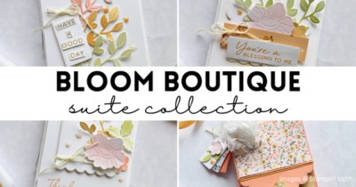
Bloom Boutique Tutorial Collection Free with Qualifying Order

Bloom Boutique Tutorial Collection Free with Your June Order

The Bloom Boutique Tutorial Collection is my special thank you gift for June, and I think you're going to love it!

Bloom Boutique Tutorial Collection - Stamp4Joy.com

When you place a $50 or more order through my online store (before shipping and tax), I'll send you a complete tutorial collection featuring a beautiful coordinating gift set.  The collection includes instructions for five handmade cards and a matching purse-style holder.  That will give you several beautiful projects that work together perfectly.

You do not need to purchase the Bloom Boutique Suite — or any of the products used in these projects — to qualify.  Simply place a qualifying order of $50 or more (before shipping and tax) through my online store, and you'll receive the tutorial collection.  Just be sure you're shopping with me (you'll see my name in the upper-right corner of the store) so I can send your tutorials.

The tutorial collection is delivered as downloadable PDF files.  Please be sure your email address is included with your order so I can send your tutorials after your qualifying order is placed.

Sometimes the hardest part of crafting isn't making the project — it's deciding what to make in the first place.  That's why I love having tutorials ready to go.  You can sit down with your supplies and simply enjoy creating without having to plan every detail yourself.

Whether you're looking for a fun weekend project or gift ideas, the Bloom Boutique Tutorial Collection is ready when you are.

If your order reaches $75 before shipping and tax, you'll also have the opportunity to purchase the June Product of the Month for just $5.  It's Wild Bunch, and it's very cute!

How to Qualify for the Bloom Boutique Tutorial Collection

If you choose to redeem Stampin' Rewards on your order, the amount redeemed will reduce your qualifying order total for both the tutorial collection offer and the Product of the Month offer.

I hope these projects bring a little extra inspiration and creative joy to your month! ❤️

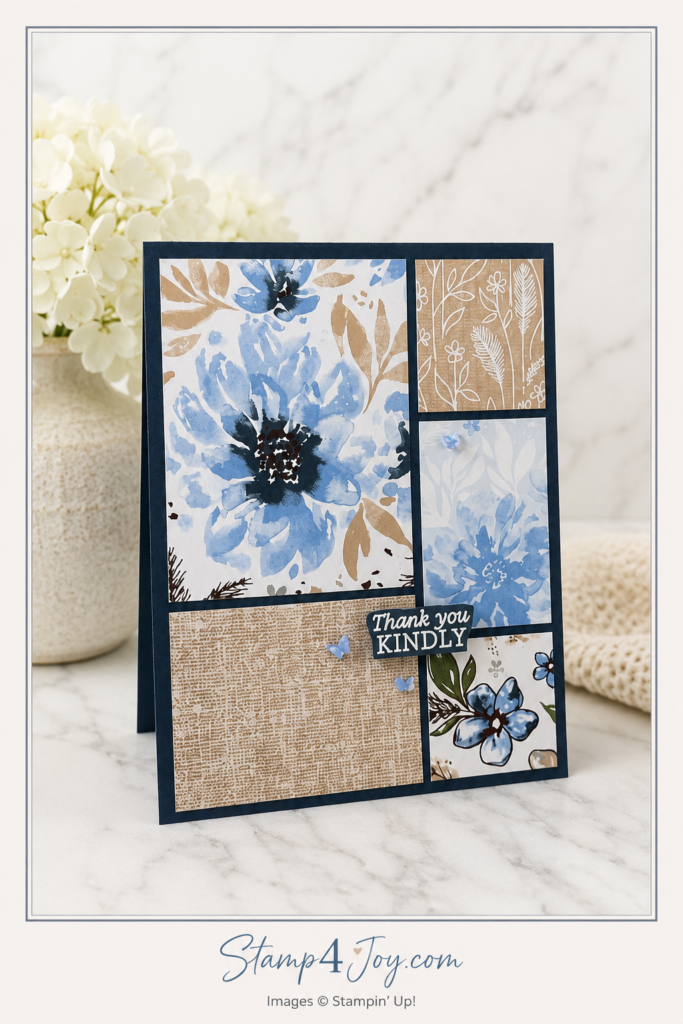
Scrap Card Layout for Using Designer Paper Leftovers

Scrap Card Layout with Delicate Dreams Paper Scraps

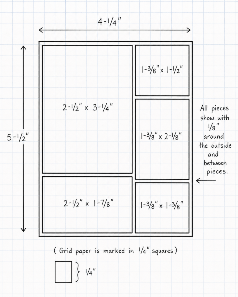
This scrap card layout started with a piece of grid paper and a pen.  Before I cut a single piece of designer paper I sketched the layout to help me visualize the finished card and work out the measurements.

My grid paper is marked in 1/4″ squares, which makes planning designs much easier.  Instead of guessing where each panel should go, I can quickly draw a rough layout and adjust the sizes until everything looks balanced.  It's a simple trick that saves time and helps avoid wasted paper.  (Remember to include the space between the paper pieces.)

You can see how I mapped out the different sections before cutting any paper.  Having the layout drawn out made it easy to calculate the measurements and ensure the spacing stayed consistent throughout the design.

The pieces I used measure:

Left Side

  • 2-1/2″ x 3-1/4″
  • 2-1/2″ x 1-7/8″

Right Side

  • 1-3/8″ x 1-1/2″
  • 1-3/8″ x 2-1/8″
  • 1-3/8″ x 1-3/8″

For this design I wanted to showcase several patterns from the beautiful Delicate Dreams Designer Paper collection.  A patchwork-style layout seemed like the perfect way to let multiple patterns shine while still keeping the card elegant and uncluttered.

One of my favorite things about this layout is how well it works with scraps.  If you've been holding onto smaller pieces of designer paper because they seemed too pretty to throw away, this design gives them a chance to become the star of the project.

Why I Love This Layout for Scrap Busting

This scrap card layout is incredibly versatile.  You can recreate it with almost any coordinating paper collection, making it a great design to keep in your idea file for future projects.

For this card I selected several patterns from the paper collection and simply cut them to fit the layout.  The soft blue florals paired beautifully with the neutral patterns, creating interest without overwhelming the eye.

The sentiment comes from the coordinating Delicate Whispers stamp set.  I heat embossed it in white on Secret Sea cardstock, then fussy cut it before popping it up with a strip of Foam Adhesive.  The raised sentiment adds just enough dimension to draw attention to the greeting.

To finish the card I added a few Hydrangea Hue butterflies from the 2026–2028 In Color Butterflies.  They add a touch of movement and sparkle while tying everything together beautifully.  I think these may be my favorite embellishments at this point (and I don't think I'm the only one)!

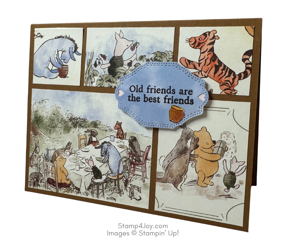
Here's another one I created using the Silly Old Bear Designer Paper, I just turned the sketch sideways.

If you're looking for a way to stretch your designer paper stash and create a card that looks more complicated than it really is, give this layout a try.  You might find yourself reaching for your scraps a little more often.  If you give it a try please send me a photo of your project, I'd love to see it!

Here's something else you can think about:  What can you do with a circle?

Sending Smiles Card with a Fun Flower Garden Twist

A Cheerful Sending Smiles Card Full of Personality

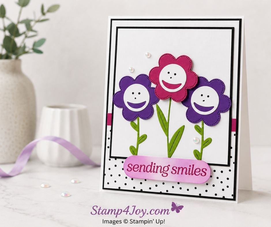
A Sending Smiles card seemed like the perfect way to showcase this little trio of happy flowers.  Sometimes a card comes together exactly as planned… and sometimes it takes a completely unexpected detour!  This project definitely falls into the second category.

I originally sat down intending to use some of the patterns from the Brights Painted Patterns collection.  Somewhere along the way, those plans

Sending Smiles Card - Stamp4Joy.com

disappeared and these smiling flowers showed up instead.  How did I get here?  I honestly couldn't tell you.  It just happens sometimes! 😂

The finished card feels playful and happy, with three flower friends standing together and doing exactly what the sentiment promises — sending smiles.

To create the flowers I used the second-smallest die from the Scalloped Blooms Dies.  Two were cut from 

Gorgeous Grape cardstock and one from Berry Burst.  The stems and leaves came from the Sweet Bugs Dies and were cut from Granny Apple Green cardstock.

The faces might be my favorite part… they remind me of my youth!  I used the closed aperture die from the Capturing Smiles Dies to create the smiling mouths and then added simple eyes and noses with a black pen.  It's amazing how a few tiny details can instantly give a card so much personality.

The background stays clean and simple, allowing the flowers to take center stage.  Layers of white cardstock matted with black cardstock create a crisp frame, while the black-and-white polka dot paper from the Beautiful Ordinary Life collection adds a playful touch without overwhelming the focal point.   A narrow strip of Berry Burst cardstock peeks out from the sides for an extra pop of color.

Bringing the Color Challenge to Life

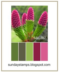
This card was inspired by the Sunday Stamps Color Challenge (SSC387), and I had a lot of fun working within the challenge colors.  Berry Burst, Gorgeous Grape, Granny Apple Green, black, and white create a bright combination that feels fresh and energetic.

For the sentiment I stamped “sending smiles” in Berry Burst ink from the Lovely Arrangements Stamp set

and cut it out using the coordinating Lovely Arrangements Dies.  To tie the colors together, I softly blended Berry Burst and Gorgeous Grape ink from the ends of the sentiment label toward the center.  The sentiment was popped up with Foam Adhesive, while the center flower was raised with Stampin' Dimensionals for a little extra dimension.

A few white Shimmering Dots finished everything off and added just the right amount of sparkle.

Sometimes the cards that wander farthest from the original plan end up being the most fun.  This Sending Smiles card certainly did, and I think these happy little flowers are proof that creative detours can lead to something even better than what you first imagined!  Now to decide who to send it to. 🙂

Out of curiosity, have you ever made this common stamping mistake?

Cutest Crew Puppy Card Inspired by a Sketch

Cutest Crew Puppy Card - Stamp4Joy.com

A Cheerful Puppy Card to Brighten Someone's Day

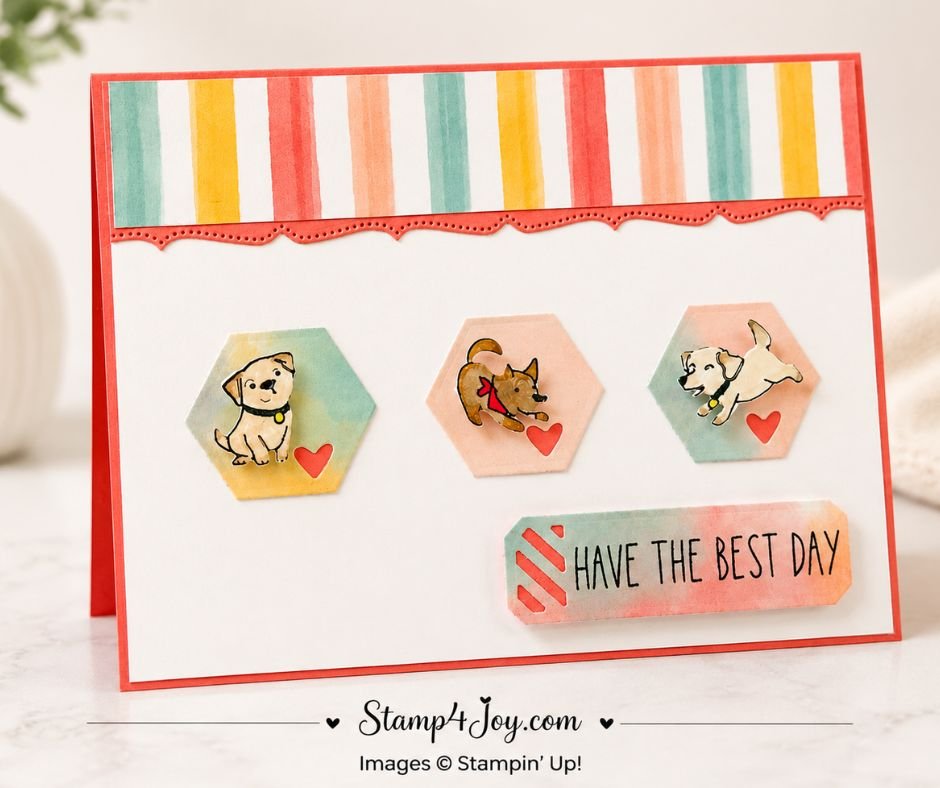
This Cutest Crew Puppy card is one of those projects that's almost guaranteed to make someone smile.  Between the playful puppies, bright colors, and sweet little hearts, it's the kind of card that feels happy before you even read the sentiment.

I started with the Beautiful Ordinary Life Suite Collection because I couldn't resist the designer paper patterns.  The colorful striped design immediately

caught my eye, and I knew I wanted it to become a focal point on the card.  I also used one of the softer multicolor patterns to create the backgrounds for the puppies and the sentiment label.

The shaped pieces were cut using dies from the Extraordinary Life Dies collection.  Those soft watercolor-style colors created the perfect backdrop for the playful puppy images without competing for attention.

The adorable dogs come from the Cutest Crew Bundle.  After stamping and coloring each puppy, I used the coordinating dies to cut them out.  Then I attached them with Mini Dimensionals for added depth.  I love how the soft colors behind them help keep the focus on their sweet personalities.

To tie everything together I backed the tiny heart openings with scraps of Flirty Flamingo cardstock that coordinate with the card base.  I repeated that same detail behind the diagonal openings on the sentiment label for a little extra pop of color.  The sentiment was then raised using Foam Adhesive Sheets to create even more dimension.

Inspired by This Week's Sketch Challenge

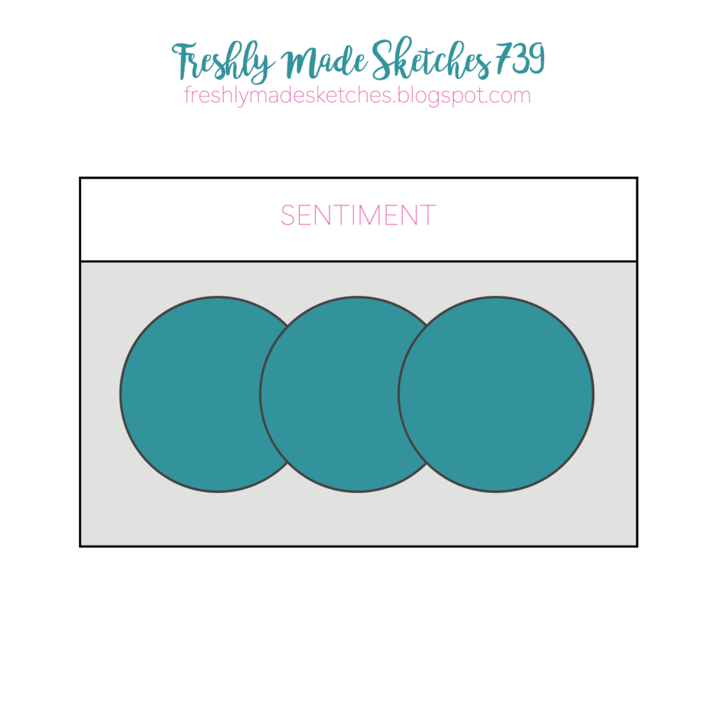
One of my favorite ways to spark creativity is by using a sketch challenge.  This card was inspired by the current one at Freshly Made Sketches.  The sketch provided the basic framework while still leaving plenty of room to personalize the design.

You'll notice how the three puppy focal points follow the placement of the sketch elements, while the striped designer paper and decorative border create visual interest across the top of the card.  If you'd like to compare the finished project to the original inspiration, be sure to check out the sketch image included on the right.

The decorative border beneath the striped paper was created using one of the long border dies from the Bordered in Beauty Dies.  Die cut from Flirty Flamingo cardstock, it provides a fun transition between the colorful striped paper and the clean white background.

Small Details Make a Big Difference

Sometimes it's the little touches that bring a card to life.  The popped-up puppies, layered hearts, dimensional sentiment, and decorative border all work together to add texture and interest while keeping the overall design clean and cheerful.

Whether you're creating a birthday card, thinking-of-you card, or simply sending a smile through the mail, this Cutest Crew Puppy card is a fun reminder that a few bright colors and a couple of adorable puppies can make someone's day a little happier.

How do you think I did with the sketch challenge?  I'd love to hear your thoughts!

Love cards that make people smile?  One of my other favorites features playful details and a sweet friendship message that's perfect for letting someone know you're thinking about them.  You can see it here.

Floral Hugs Card Featuring the Life in Bloom Dies

A Floral Hugs Card That Took an Unexpected Turn

This Floral Hugs Card started off in a completely different direction.  Have you ever sat down to make a card with a clear plan in mind, only to find yourself changing course halfway through?  That was exactly what happened here.

The only thing that survived from my original idea was the use of the beautiful Life in Bloom Dies.  As I worked, the design gradually evolved into this soft

cvase of flowers card, and honestly I'm much happier with the final result.  Sometimes the best projects happen when we stop forcing an idea and simply follow where our creativity wants to go.

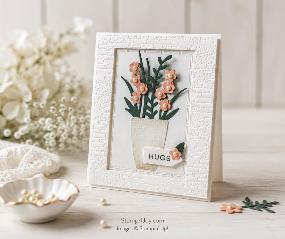
The finished card features a clean white-on-white design with just a few carefully placed touches of color.  Those subtle accents help the flowers become the focal point while still keeping the overall design elegant and calming.

The flowers were die cut from Crisp Cantaloupe Cardstock and layered with small Antique Pearls in the centers.  For the foliage I used Peaceful Pine Cardstock, which provides a beautiful contrast against the lighter background.

Adding Soft Color and Texture

To create a little extra depth, I lightly blended Balmy Blue behind the floral arrangement and added Crumb Cake blending around the vase and lower portion of the panel.  These soft touches help ground the design without overpowering it.

The focal panel was cut using the retired Textured Notes Dies.  Rather than discarding the surrounding opening, I used it as a frame around the scene. The frame was popped up with Foam Adhesive Sheets, creating dimension and helping draw the eye directly to the flowers.

For even more texture I embossed the frame  using the retired Exposed Brick 3D Embossing Folder.  If you don't have that folder, the Stone & Vine 3D Embossing Folder would provide a similar textured effect and work beautifully with this design.

Why This Design Works

One of my favorite details is how the combination of embossing, blending, and dimension adds interest while still keeping the card simple and uncluttered.  The white-on-white background allows the flowers and foliage to shine without competing for attention.

To finish the card I stamped the Hugs sentiment in Peaceful Pine and tucked it near the base of the vase.  A single coordinating flower and leaf helps tie the sentiment into the overall design and balances the layout.

This Floral Hugs Card could easily be used as a thinking of you card, sympathy card idea, encouragement card, or simply a way to let someone know you're thinking about them.  Sometimes a handmade floral card can just make someone's day.

And if your next project doesn't go according to plan, don't be afraid to change direction. You may end up liking the new version even better.

If you enjoy floral card designs, be sure to take a look at this Handmade Floral Thank You Card project as well.  It features a different arrangement and color palette while showcasing the same timeless beauty that floral cards bring to any occasion.

July Birthday Card with Alphabet A La Mode Dies

A Bold July Birthday Card for Summer Celebrations

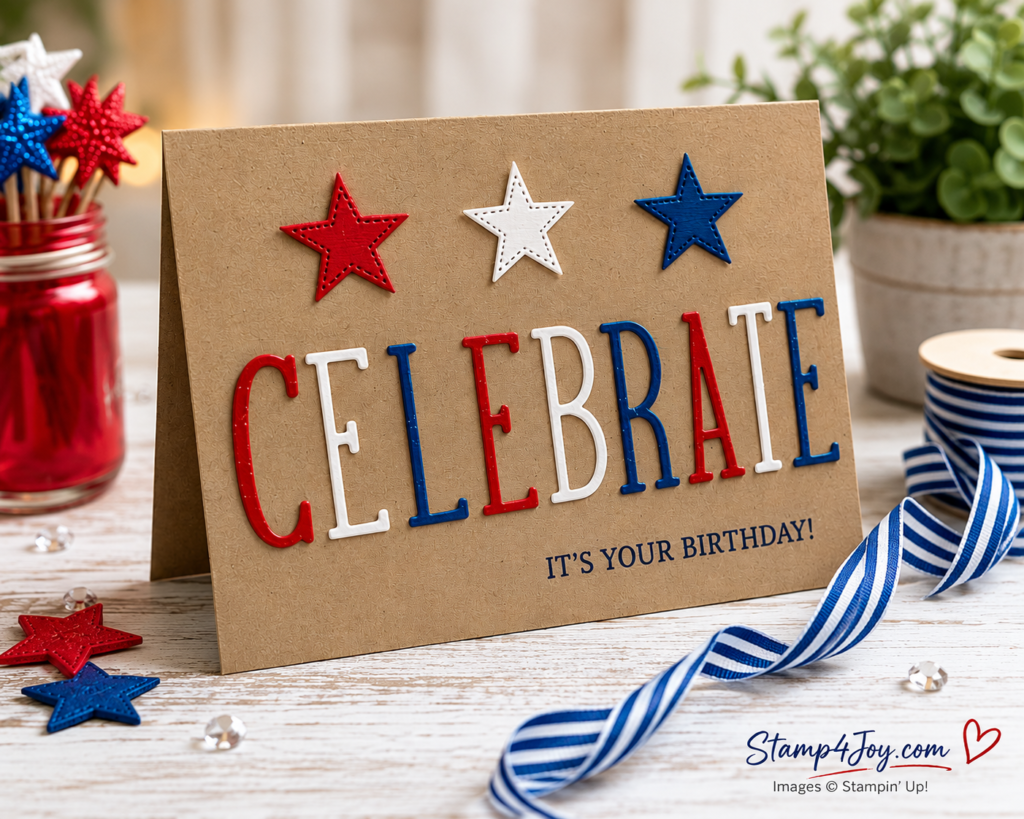
A July Birthday card is the perfect way to celebrate summer birthdays, and this design would work just as well for a Fourth of July picnic invitation or holiday greeting.

When I started creating this card I wanted something bright, festive, and fun.  The red, white, and blue color combination immediately set the tone for a cheerful summer project.  However, the real star of the show is the Alphabet A La Mode Dies.

Alphabet A La Mode Dies Make a Bold Statement

Even if you're not a scrapbooker, don't overlook alphabet dies.  They can make a bold statement on handmade cards and other projects and quickly become the focal point of a design.  In fact, they're one of my favorite ways to create custom greetings that really stand out.

If you don't already have these dies in your collection, now is a great time to take another look.  They're currently on the Last Chance List at 50% off!  The set includes doubles of commonly used letters such as A, E, I, L, N, R, S, and T, plus numbers, making it incredibly useful for both scrapbook layouts and card making projects.

For this July Birthday card I cut the letters from traditional red, white, and blue cardstock.  To add even more patriotic flair I included stars cut with the Playful Packaging Dies.  If you don't own those dies yet, they're quickly becoming one of my favorites from the new catalog.

The birthday greeting comes from the Words of Beauty stamp set and was stamped in Blueberry Bushel ink to coordinate with the color scheme.

A Simple Trick for Gluing Skinny Die Cuts

One little tip:  Because the letters are fairly narrow, I found it easier to apply adhesive using a Silicone Craft Sheet.  I placed a small amount of Liquid Glue on the sheet and used a silicone basting brush to lightly tap glue onto the backs of the letters.  It gives great coverage without excess glue squeezing out around the edges.  I simply trimmed the end off one of the brushes and keep it in my craft room specifically for this purpose.

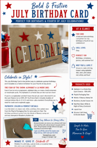
If you'd like a quick reference sheet for this project, I've put together a printable Project Spotlight that includes the featured products and adhesive tip.

Download the printable Project Spotlight here.

Whether you're making a birthday card, a party invitation, or a festive summer greeting, this project shows how a simple alphabet die set can create a big impact.

And don't forget to think outside the box and use your stamps in unique and novel ways, like this 4th of July card idea.

Black and Gold Birthday Treat Bag with the Playful Packaging Dies

A Black and Gold Birthday Treat Bag with a Second Life for Christmas Paper

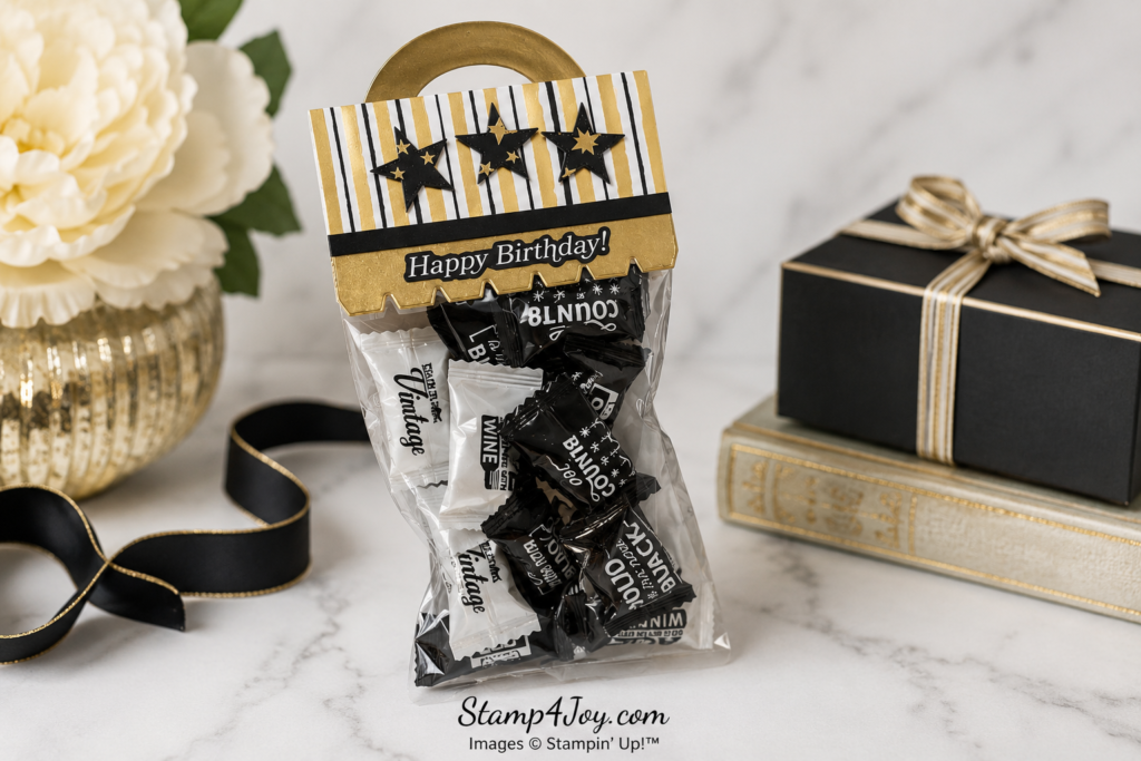
When I first saw the Playful Packaging Dies I wasn't sure how much I would use them.  Now they seem to find their way onto my craft table again and again!

This Black and Gold Birthday Treat Bag was created for my brother-in-law after he finally made it home

from nearly eight weeks in the hospital and rehab.  His birthday is coming up, and I wanted to put together something a little fun and lighthearted to celebrate being back home.

Christmas Paper Beyond Christmas

One of the things I love about this project is that it gave me a chance to use some leftover designer paper.  The striped pattern and the paper with the gold stars came from the Modern Christmas 12″ x 12″ Specialty Paper, which is currently at a discount on the Last Chance List while supplies last.  While the black and gold color combination was gorgeous for Christmas projects, it works just as beautifully for birthdays, New Year's celebrations, anniversaries, and other special occasions.

I suspect many of us have designer paper scraps tucked away that could be transformed into beautiful projects like this.  Sometimes all it takes is looking at a paper with fresh eyes and imagining it outside its original season.

The Happy Birthday greeting came from the Greetings For All Mix & Match Ephemera Pack, making the project quick and easy to assemble.  A few layered stars completed the topper and tied everything together.

Of course, the real fun is what's inside. 🙂  I filled the bag with individually wrapped candies featuring sayings like “You're Not Old, You're Vintage,” “Old Is the New Black,” and “Age Gets Better With Wine.”  A little humor seemed like the perfect finishing touch.  

Grab the mints here.

This project is a reminder that leftover paper, a simple die set, and a few treats can come together to create a gift that's both thoughtful and fun.

Instead of treat bags maybe you'd like to try a card in a box.

Beautiful Ordinary Life Get Well Card with Cheerful Layers

Beautiful Ordinary Life Get Well Card Ideas - Stamp4Joy.com

Cheerful Get Well Card Ideas for Difficult Days

When I sat down to create this card I had get well card ideas on my mind.  My brother-in-law has spent the last seven weeks in either the hospital or a rehabilitation center.  It's been a long journey for him, and I wanted to send something bright and encouraging to help lift his spirits.

Of course a handmade card can't change the

situation, but it can remind someone they're loved and being thought about.  That's exactly what I hoped this card would do.

For this design, I started with a sketch challenge from Sunday Stamps and also wanted to participate in a challenge at Just Add Ink that is featuring polka dots, so this card ended up working perfectly for both!

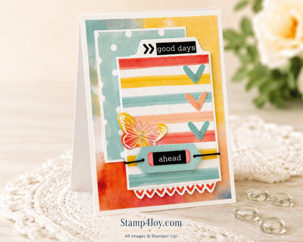
The colorful stripes from the Beautiful Ordinary Life Designer Paper immediately caught my attention.  The soft rainbow-inspired palette felt cheerful without being overwhelming, which seemed perfect for an uplifting card.

To coordinate with the paper I added elements from the Extraordinary Life Stickers.  The sentiments “good days” and “ahead” felt especially meaningful for a get well card. Together they create a simple but hopeful message.

Building Layers and Visual Interest

The tab holding the “good days” sentiment was created with the Extraordinary Life Dies.  For the label featuring the “ahead” sentiment, I used a die from the Bordered in Beauty Bundle.  The same bundle also provided the row of stamped and die-cut hearts along the edge.

To add a little extra detail, I threaded black twine through the ends of the label and wrapped it around the focal layer.  The contrast helps draw attention to the sentiment while adding texture without overwhelming the design.

A delicate butterfly and several heart stickers from the sticker collection soften the overall look.   Finally, I added clear epoxy accents from the Ladybug Garden Epoxy Shapes for a touch of shine and dimension.

This card reminds me that encouragement doesn't have to be elaborate.  Sometimes a few cheerful colors, a hopeful sentiment, and a handmade touch are enough to brighten someone's day. 

Do you enjoy creating cards that encourage and uplift others?  Leave a comment and tell me whether you prefer bright, cheerful color palettes or softer, calming designs for your get well card ideas.

If you're looking for more inspiration from the world around you, my Nature's Endless Palette Guide for Paper Crafters can help you discover fresh color combinations and design ideas inspired by nature's own beauty.