Scenic Coast Suite Retirement Card That’s Easy to Make

Scenic Coast retirement card with bold color and simple design

This Scenic Coast retirement card is one of those projects that looks detailed, but is actually very simple to put together since the designer paper really does most of the work here.  All of these supplies will be available in the upcoming May-Aug. 2026 Catalog.

Easy Scenic Coast Retirement Card Idea - Stamp4Joy.com

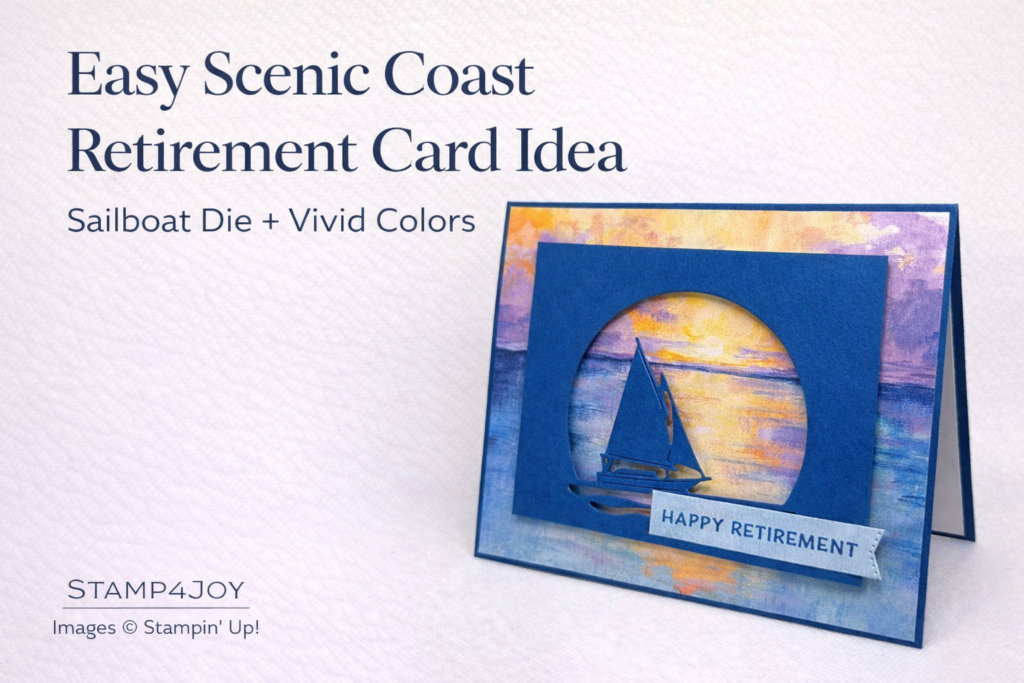
I used one of the sheets from the Scenic Coast 6″ x 6″ Specialty Designer Series Paper, and the colors are just gorgeous.  The sunset tones with a hint of iridescence make such a beautiful background.

I trimmed the paper down to 5-3/8″ x 4-1/8″ and layered it onto a Blueberry Bushel cardstock base.  That deep blue really helps frame the scene and pull everything together.

Scenic Coast retirement card details that add dimension

To create the focal point I used the sailboat die from the Sunset Coast Bundle and cut it from Blueberry Bushel cardstock.

The window-style opening lets the background show through and gives the card some extra interest without adding complexity.

For the sentiment I used a lighter section of the designer paper I'd previously trimmed off and stamped “Happy Retirement” in Blueberry Bushel ink.  I love when you can use your scraps like this and still get a perfectly coordinated look.  I cut a banner on one end using one of the dies from Stylish Shapes.

Foam adhesive was used behind the sailboat layer to give it some lift and dimension.

This is a great example of how a strong piece of designer paper can carry the design while you keep the rest simple.

Here's an example of a way you can build your own scenic cards when you don't have designer paper that works.

Do you like letting your designer paper be the star, or do you prefer building more detailed layers on top?

Lily of the Valley Thank You Card Using Valley in Bloom Suite

Lily of the Valley Thank You Card - Stamp4Joy.com

Lily of the Valley thank you card with soft layers and detail

This Lily of the Valley thank you card came together so beautifully, especially with the soft background and layered details.

I started with the Valley in Bloom Designer Paper and trimmed it to create that dreamy floral background scene.  It really does most of the work for you, which I always appreciate.  Then I added a Pretty Peacock cardstock base to frame everything and give it a little depth.

From there I began building the focal point.

The leaf and stems were cut from Garden Green cardstock, which gives a nice contrast against the softer background.  I lightly sponged Pretty Peacock ink along the edge of the leaf for a little extra dimension.  It’s a small step, but it makes a difference.

The flowers were cut from Barely Blush cardstock and gently sponged along the edges using Golden Glow ink.  That subtle shading helps them stand out without overpowering the design.  My son thought I should have sponged some purple instead, so I think I'll try that next time.  🙂

Once the flowers were layered onto the stems I attached the whole piece to the card front to create that lifted, dimensional look.

Lily of the Valley thank you card details that bring it together

The small card sentiment was stamped in Garden Green ink and placed in the upper right corner where there was some open space.  I always like letting the design guide where that goes instead of forcing it.

To finish it off I added a few of the Barely Blush butterflies from the 2026–2028 In Color Butterflies.  They add just a soft touch of movement, which really brings the whole card to life.

This is one of those cards where the combination of designer paper and a few layered elements creates something that feels detailed without being complicated.

If you enjoy building dimension without a lot of fuss, this is a fun one to try.

Here's another floral thank you card you can check out.

Do you tend to add extra layers to your cards, or do you prefer to keep things more simple?

Stampin’ Up! Ink Pad Changes: New Design Coming in 2026

Stampin’ Up! Ink Pad Changes - Stamp4Joy.com

Stampin’ Up! ink pad changes are coming in 2026

Stampin’ Up! ink pad changes are officially on the way, and there are some exciting updates to look forward to.  If you’ve been around stamping for a while, some of this may feel familiar in the best way.

Starting in May 2026 the new ink pad design will begin rolling out.  However, it won’t happen all at once.  Instead it will start with the brand new 2026–2028 In Colors.

Let’s take a closer look at what’s changing.

Want to see the new ink pads in action? Here’s a quick overview from Stampin’ Up! that walks through the updates and features.

A closer look at these Stampin’ Up! ink pad changes

One of the biggest updates is the return to a felt-style ink pad.  Many stampers have missed this, and for good reason.  Felt pads are known for rich, even ink coverage. They also tend to give a beautiful, clean image, especially with more detailed stamps.  If you enjoy crisp impressions, this is something to be excited about.

Another standout feature is the brand-new case design… it’s magnetic!

The new ink pad cases are designed to be both functional and easy to use.  They open smoothly, close securely, and are made to stack neatly in your craft space.  Even better, they will still work with your current Stampin’ Up! storage systems.

Here are a few quick highlights:

• Magnetic closure for a secure snap
• Easy, mess-free opening — great for those with arthritis!
• Stackable design for better organization

The new pads measure 4-15/16″ x 3-3/8″ x 5/8″ and will be priced at $14.00.


What these ink pad changes mean for you

This transition will happen gradually, so there’s no need to feel rushed.

The new design will debut with the 2026–2028 In Colors.  Then, in 2027, the remaining ink colors will transition as part of a planned color refresh.  Over time the current style will slowly phase out.

But here’s the most important part… you do not need to replace your current ink pads.  They will continue to work beautifully.  There’s no reason to switch everything at once, you can simply upgrade as needed over time when it feels right.  I actually love this kind of transition because it gives you flexibility without pressure.

Are you excited to try the new ink pads, or are you happy sticking with your current ones for now?

Puppy Card Idea Using a Sketch and Cutest Crew

Puppy Card Idea - Stamp4Joy.com

A Puppy Card Idea Using a Sketch

This puppy card idea started with a sketch from The Paper Players, but I ended up adding my own little twist along the way.

I used Pecan Pie for the card base and paired it with a soft green background from the Lovely Blossoms Designer Paper collection. That combination gave the card a warm, grounded feel that worked perfectly with the playful theme.

Here’s the sketch I used as a starting point. It’s always interesting to see how a design shifts once you start creating.

Instead of following the sketch exactly I decided to replace the strip across the top with die-cut paw prints. That allowed the Pecan Pie to peek through both above and below the puppies, which added a fun bit of movement to the design.

Adding Personality to This Puppy Card Design

The adorable puppies and flowers came from the Cutest Crew Bundle, and I colored everything in with Stampin’ Blends. That’s always one of my favorite parts — bringing the images to life with just a bit of color.

The flag strip was cut from Early Espresso cardstock, and the sentiment was stamped in Pecan Pie and die cut using one of the circles from the Stylish Shapes Dies. It all ties together nicely without feeling too busy.

This puppy card idea is a good reminder that sketches are a starting point, not a rulebook. A small change can make a design feel completely your own.

Do you usually follow a sketch closely or do you like to change things up once you get started?

Here's a sweet handmade friendship card featuring those darling puppies, too!

A Summer Splash Birthday Card With Lovely Arrangements

A Summer Splash Birthday Card With Soft Texture and Neutral Layers

This Summer Splash birthday card started with a simple idea:  let one beautiful color do the talking.

I kept most of the palette neutral with white and Crumb Cake so the Summer Splash die-cut layer could really stand out.  I know I’m going to miss this color when the 2024–2026 In Colors retire.  It has such a fresh, happy feel without being overpowering.

If you love it too, keep in mind that retiring In Color products often sell out early.

Subtle Texture Makes a Big Difference

The white background panel was embossed with the Eyelet 3D Embossing Folder.  It adds quiet texture

Summer Splash birthday card - Stamp4Joy.com

without competing with the die-cut pattern from the Lovely Arrangements Bundle.

The floral elements and “happy birthday” sentiment both came from the stamp set, while the coordinating dies created the detailed background layer and leaf shapes.  Everything works together effortlessly, which makes this bundle especially versatile.

I added just a touch of Wink of Stella glitter to the flower center for a hint of sparkle.  Not too much, just enough to catch the light when you tilt the card.

Layering everything onto a Crumb Cake base helped ground the design and keep it feeling warm and cohesive.

This Summer Splash birthday card is proof that you don’t need a rainbow of colors to create something eye-catching.  Sometimes one standout shade paired with texture and thoughtful layering is more than enough.

Are you planning to stock up on any In Colors before they retire?  I’d love to know which one you’ll miss most.

Here's a lovely handmade floral card using the same suite.

Join Stampin’ Up! and Get the Stampin’ Positioner Free (Ends March 2)

Why Now Is a Great Time to Join Stampin’ Up!

If you’ve been thinking about whether to join Stampin’ Up!, this is one of those moments that’s hard to ignore.

Through March 2nd anyone who joins will receive the brand-new Stampin’ Positioner added to their Starter Kit at no additional cost.  That’s on top of the already generous value you get when building your kit.

The Starter Kit allows you to choose $125 worth of products and pay just $99, plus free shipping.  For a limited time the Stampin’ Positioner is included automatically, making it an even stronger value.

What Happens When You Join Stampin’ Up!

Beyond the free tool there are real, ongoing benefits to joining Stampin’ Up!

You receive:

• 20–25% product discount and commission
• VIP early access to new products
• Invitations to global demonstrator events
• The opportunity to build a community of creative friends

Some join simply for the discount.  Others enjoy the early access to new products.  And some discover they love sharing their creativity with others.

There’s no requirement to “build a business” unless you want to.  You can shape it to fit your goals and your season of life.

If you’ve been waiting for a little nudge, this just might be it.  The free Stampin’ Positioner offer ends March 2.

If you’re ready to move forward, you can get started with your Starter Kit here.

If you’re wondering what joining has looked like for me personally, I’ve shared more in my Stampin’ Up! story.

How I Store Stampin’ Up! Stamps and Dies in the New Packaging

Keeping My Stampin’ Up! Stamps and Dies Organized

Stampin’ Up!’s new stamp and die packaging looks great — but it did require a tiny shift in how I organize things.

In this short video I’m sharing exactly how I store Stampin’ Up! stamps and dies so they stay neat, visible, and easy to grab when I’m creating.  Nothing complicated.  Just what works for me.

If you’re like me, you want to spend your time making cards — not hunting for that one die you know you own.

A Simple System That Keeps Everything Together

I keep my stamps and coordinating dies stored together so I don’t have to think about it later.  When I reach for a set, everything is already in one place.

For the dies, I use magnetic storage cards inside the  sleeves.  It keeps them flat, secure, and easy to use.

And if you’re thinking about picking some up, the company I use is offering free shipping this weekend.  If you’ve been meaning to organize your dies, this might be a good time to do it. (Stamp-n-Storage.)

I don’t go into great detail in this post because the video shows everything clearly in about ten minutes.

If you're interested in converting your old stamp sets and dies out of the old packaging and into new, Stampin' Up! sells empty Stamp & Die Organizers, too.

Sometimes the best organization system is simply the one you’ll actually maintain.  If you’ve found a storage method you love, I’d be curious what you’re using. I’m always open to refining my setup.

This container keeps my cleaning cloths damp for days, which makes stamp cleanup quick and easy.  You can grab one HERE.

Pair it with these microfiber cloths, and you’ll have a simple system that helps prevent staining and keeps your stamps in great shape.

Cute Ant Card Idea for Summer Celebrations

How This Cute Ant Card Idea Turned Into a Picnic Party

This cute ant card idea practically made itself once those little ants started marching across my desk.

I originally had a completely different bundle in mind.  But when I sat down to craft, the Sweet Bugs Bundle and coordinating Cute as a Bug Designer Paper were still nearby from a class project.  Sometimes the best decisions are the easiest ones, right?

That red checked pattern definitely reminds me of a summer picnic tablecloth.  So obviously, it was time for the ants to throw a party!

To give the card some texture, I embossed the Pecan Pie card base with the Birch Wood 3D Embossing Folder.  It adds that subtle picnic table feel without overwhelming the design.  The gingham layer was mounted on Very Vanilla to help define it, and I repeated that with the sentiment strip to keep everything cohesive.

Adding Movement and Whimsy to This Cute Ant Card Idea

The little ant parade along the bottom right makes me smile every time I look at it.  Then up in the corner, those young ants carrying the grape look like they’re spreading the word about the celebration.  I mean, if ants had a group chat, this would be it.

The sentiment was stamped in Pecan Pie and lifted with a strip of Foam Adhesive Sheet so it stands evenly across the card front.  A few ladybugs finished it off with just enough whimsy.

This cute ant card began with a sketch from Freshly Made Sketches.  I don’t always start that way, but when I do, it pushes me in directions I might not choose on my own.  This one definitely turned into a summer favorite.

These little ants make me smile every time I see them marching across the card.

If you were sending this, who would you mail it to — a summer birthday, a thank-you, or just because?

Here's another cute b'day card idea featuring a lady bug!

Color Coach Card Ideas Inspired by a Birthday Pie

Color Coach Card Ideas That Stretch Your Comfort Zone

Color Coach card ideas are a fun way to shake up your usual color habits — especially when someone else chooses the combination for you.

This time, I asked my son to pick a color combo from the Color Coach.  I suspect Peach Pie was fresh on his mind since he requested a Peach Melba pie for his birthday about ten days ago.  And yes, it was delicious. 🙂

The combination included Peach Pie, Coastal Cabana, and Blackberry Bliss.  I’ll admit, Coastal Cabana has become one of my favorite colors.  I would love to see Stampin’ Blends in that shade.  Blackberry Bliss, 

Color Coach Card Ideas - Stamp4Joy.com
Color Coach Combo: Peach Pie, Coastal Cabana, Blackberry Bliss - Stamp4Joy.com

however, is not one I reach for often.  That made this an interesting challenge.

Instead of overthinking it, I pressed the ink pads onto stamping blocks and used water with the ink to create

a soft watercolor background.  The extra water muted the Blackberry Bliss beautifully.  It blended into the other tones rather than dominating them.  That felt more “me,” since I naturally lean toward lighter shades.

Let the Color Coach Do the Heavy Lifting

When you use Color Coach card ideas, the decision-making is already handled.  You’re not staring at a wall of ink pads wondering what might work together.  The combination is chosen for you, and that frees up creative energy.

The large white leaf die cut (from the Nature's Symphony Dies) was already sitting on my desk from another project.  Against the watercolor background it suddenly felt intentional instead of leftover.  I stamped the sentiment in Summer Splash ink, which shows up nicely against Coastal Cabana.  I even double cut the sentiment piece, which means a small rectangle is waiting for another card.  That feels like a bonus!

Once everything dried, I layered the watercolor panel onto Peach Pie cardstock and centered it on the card base.

I’m curious — do you have colors you love and others you avoid?  Sometimes the Color Coach nudges us right into growth.

If you enjoy experimenting with ink and water, you might also like this watercolor homemade thank you card that uses a completely different palette and technique.

If color combinations sometimes feel overwhelming, I’ll be sharing a simple resource soon that makes using the Color Coach much easier.  Stay tuned.

Cardmaking Tips: Using What’s Already on Your Craft Table

Using What's Already on Your Craft Table - Stamp4Joy.com

Why Simple Cardmaking Tips Often Work Best

Cardmaking tips don’t always involve new tools or techniques.  Sometimes the best ideas come from what’s already sitting in front of you.  Lately I’ve noticed how often my next card begins with something left on my table.  Extra alphabet letters.  A trimmed strip of patterned paper.  A die cut I didn’t

end up using.  Instead of cleaning everything up immediately, I let it sit.  That’s usually when something new starts forming.

Designing this way feels different.  The colors are mostly chosen.  The shapes are already cut.  There’s less pressure to make it perfect because I’m responding instead of starting from scratch.

Reducing Decision Fatigue Protects Creative Energy

There’s even research suggesting that decision fatigue —  the mental exhaustion that builds after making many choices — can make it harder to stay creative.  When we reduce unnecessary decisions it frees up mental energy for more meaningful work.  Working with what’s already on your craft table naturally limits those extra choices and helps protect your creative flow.

That’s one of the most practical cardmaking tips I’ve learned over the years — don’t underestimate what’s already within reach.  A leftover sentiment becomes the focal point.  A small strip becomes the border that pulls everything together.  What could have been clutter turns into a starting point.

It’s also freeing.

When everything is brand new I sometimes overthink it.  When I’m working with what’s already on my table, I feel more playful, more willing to experiment.  More relaxed.

And honestly, it’s efficient.

Instead of seeing extras as scraps, I’ve started seeing them as creative prompts.

If you’ve ever wondered what to do with all those paper scraps, I wrote about turning them into beautiful cards on a budget.

Now I’m curious — do you clean everything up right away, or do you let things linger and see what happens next?