New Stampin’ Up! Catalog Day and Join Special
New Stampin’ Up! Catalog Day + A Special Join Offer
There’s a lot happening today, and it’s one of those days that feels full of fresh inspiration. It’s new Stampin’ Up! catalog day, and there’s so much to look through and enjoy.
If you’re anything like me, flipping through a new catalog brings a mix of ideas and possibilities. It’s hard not to start thinking about what you’d like to try first.

New Catalog Inspiration
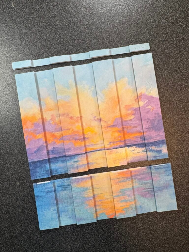
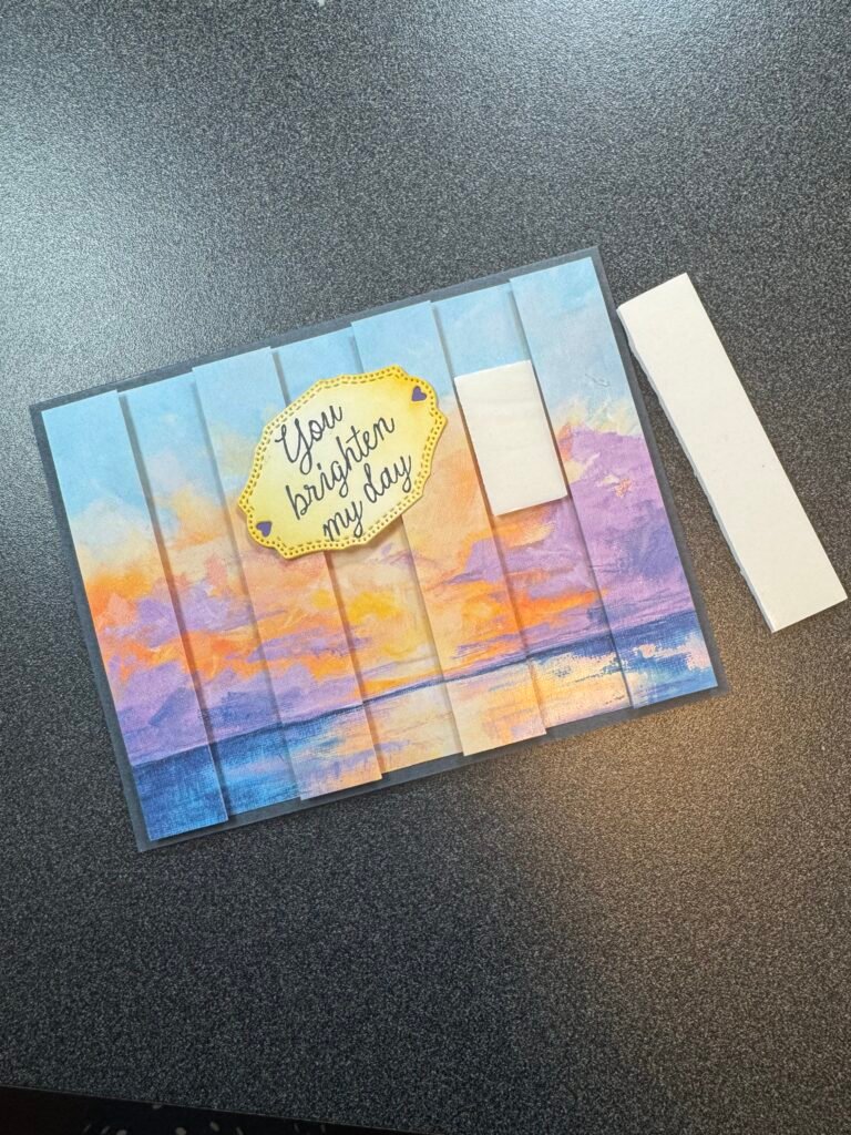
The new catalog introduces fresh colors, new products, and creative ideas to explore. It’s the kind of release that makes you want to sit down and create, even if you only have a little time.
You might find a new favorite stamp set. Or maybe it’s a paper collection that sparks an idea. Sometimes it’s just one small detail that gets everything started.
A Join Offer to Take a Look At
Along with the new Stampin’ Up! catalog day there’s also a special join offer right now.
When you join as a demonstrator you’ll receive the new 2026–2028 In Color Stampin’ Pads free as part of your Starter Kit. If you’d prefer something different you can choose an extra $35 in products instead. It’s a simple way to start with items you’ll actually use.
What You’ll Enjoy as a Demonstrator
There are also ongoing benefits that come with joining.
You’ll receive a 20–25% discount on products and get early access to new releases and catalogs. There’s also the ability to earn extra commission, along with access to training and events.
It’s a flexible way to enjoy your crafting a little more — and you can make it exactly what you want it to be. You can keep it simple and just enjoy the discount or you can explore it a little more. It’s easy to make your own.
Take a Look When You’re Ready
New Stampin’ Up! catalog day always brings a fresh start.
If you’ve been thinking about trying something new, this might be a good time to take a look and see what catches your eye.