Father’s Day Lighthouse Card with the Sunset Coast Bundle

Coastal Inspiration Without Designer Paper

The Father's Day Lighthouse Card shown here proves you don't need patterned paper to create a beautiful coastal scene.

The Sunset Coast Bundle offers plenty of possibilities, even if the Scenic Coast Paper is currently out of stock.  Instead of waiting you can build your own seaside setting with the detailed dies and coordinating stamps.
Father's Day Lighthouse Card - Stamp4Joy.com

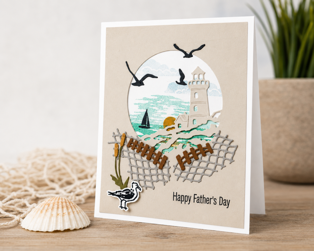
For this Father's Day lighthouse card I focused on the lighthouse aperture to frame a seaside view, as though you're standing on the beach looking out over the water.  The layered elements create depth and tell a story without needing many supplies.  The fishing net, sailboat, sand fence, and seagulls work together to create a peaceful coastal scene. 

I especially love the addition of the little seagull standing near the bulrushes.  Those details come from the Relaxing Waterside Bundle and adds a touch of personality to the design.

Why the Sunset Coast Bundle Is So Versatile

One of my favorite things about the Sunset Coast Bundle is how easily it adapts to different occasions.  The greetings included in the stamp set work beautifully for retirement cards, congratulations cards, weddings, encouragement cards, and everyday greetings.  Simply changing the sentiment can completely transform the finished project.

For this card I paired the bundle with the Relaxing Waterside Bundle and used the Happy Father's Day greeting (along with the seagull and bulrush).  Together, the two sets offer even more possibilities, including birthday cards, masculine cards, Father's Day projects, and coastal-themed greetings for any occasion.

When you find products that work well together, creating becomes much easier.  You can mix and match images, sentiments, and dies to build a variety of cards without starting from scratch every time.

Whether you're making a Father's Day card or simply creating a relaxing coastal scene, the Sunset Coast Bundle offers plenty of inspiration long after the designer paper is gone.

Whether you're creating coastal scenes, floral cards, or seasonal projects, nature is one of the best sources of inspiration.  If you'd like help choosing colors, spotting interesting textures, and finding fresh ideas for your cards, take a look at my Nature's Endless Palette Guide for Paper Crafters.
Bloom Boutique Designer Paper: Which Color Would You Choose?

Two Bloom Boutique Designer Paper Designs, One Favorite

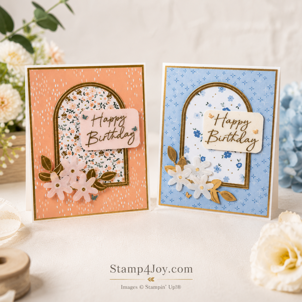
When I sat down to create these birthday cards with the Bloom Boutique Specialty Designer Paper, I immediately ran into a delightful problem –I couldn't decide which pattern and color combination I liked best.  So instead of choosing one, I made both.

One card features soft Hydrangea Hue tones, while the other highlights the warm beauty of Crisp Cantaloupe.  Although the colors are quite different, I kept both designs largely monochromatic for a clean and elegant look.

The gold arch focal point (created with a couple of the Everyday Arches Dies) creates a beautiful frame for the patterned paper, while the gold accents add just enough shine without overwhelming the design.  Gold foil leaves tucked behind the floral clusters help tie everything together and give each card a polished finish.

Bloom Boutique Designer Paper Makes Color Choices Easy

One of the things I enjoy most about the Bloom Boutique Designer Paper is how easy it makes coordinating a project.  The patterns already work beautifully together, so creating a cohesive design feels effortless.

I used the Boutique Blossoms Dies to create the flowers from the beautiful Sunset Shimmer Vellum, whose subtle sparkle catches the light beautifully.  Photos never seem to capture the full effect, but the subtle shimmer catches the light beautifully and adds a touch of elegance.  Small gold centers help tie the flowers into the gold accents throughout the card.

The embossed birthday greeting adds another layer of shine while keeping the design simple and uncluttered.  It came from the coordinating Scalloped Blooms stamps.  Sometimes a few carefully chosen details create more impact than a card filled with embellishments.

Which One Would You Choose?

Now comes the hard part:  If you could only choose one, which would it be?  Do you prefer the soft floral warmth of the Crisp Cantaloupe version or are you drawn to the cool, calming tones of Hydrangea Hue?

I still haven't decided which one I like best.  Fortunately, I don't have to.

And that's one of my favorite things about card making — sometimes the creative process is just as enjoyable as the finished project.

I'd love to hear which one you would pick.

Want More Card-Making Inspiration?

If you enjoy exploring color combinations and design ideas, be sure to subscribe to my newsletter for project inspiration, creative tips, and special offers delivered right to your inbox.

Looking for another fun birthday card idea?  Check out this interactive coloring card that becomes part birthday card and part creative activity.

Try this Happy Birthday Coloring Card Idea.

Life in Bloom Bundle Simple Spring Card Idea

A Simple Spring Card with the Life in Bloom Bundle

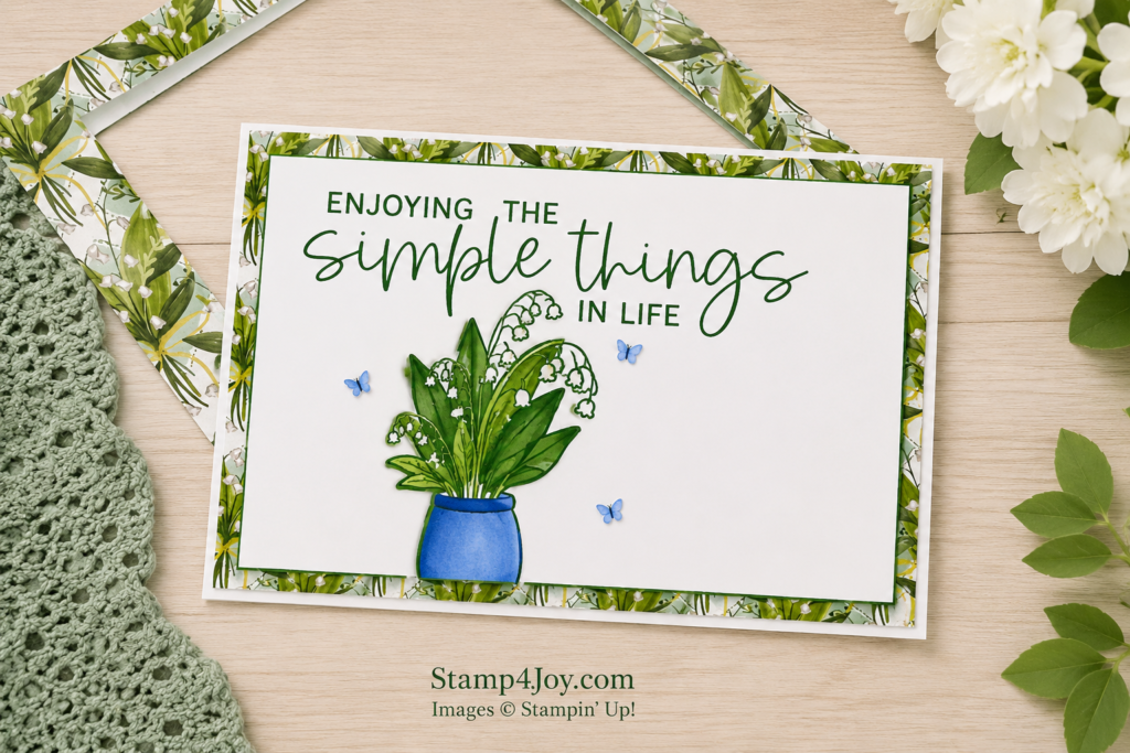
The Life in Bloom Bundle would work beautifully for scrapbook layouts, but today I wanted to focus on a springtime card instead.

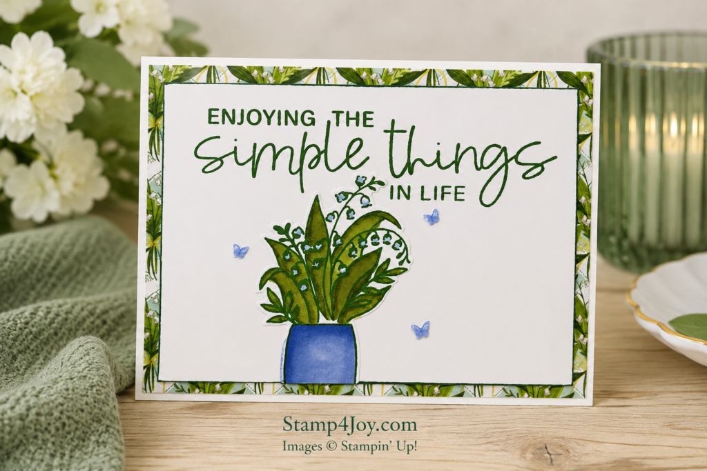
As soon as I saw the large sentiment, “Enjoying the simple things in life,” it immediately stood out to me.  Honestly, it’s something I think we all need to remember more often.

Life in Bloom Bundle Simple Spring Card

It may not always feel like it in the moment, but the everyday things are usually what become the most meaningful memories later.  A quiet afternoon.  A handmade card.  A little creative time at the table.  Those simple moments matter more than we sometimes realize.

Soft Florals and Spring Details

For this card I stamped the vase and flowers, then colored them with my alcohol markers. I attached the vase toward the bottom left of the card and simply trimmed off the overlap along the edge.

Valley in Bloom Designer Series Paper - Stamp4Joy.com

The beautiful paper in the background came from the coordinating Valley in Bloom 12″ x 12″ Designer Series Paper collection.  And honestly, these papers are so pretty that it almost feels wrong to waste any of them.

I cut the center from the designer paper layer before attaching it to the card front so I could save that hidden piece for another project later.  We always want to stretch our supplies whenever we can, right?

The Finishing Touches

To finish the card I added a few delicate butterflies from the 2026–2028 In Color collection.  They add just enough softness without taking attention away from the flowers and sentiment.

Interestingly, this card ended up a little different than I originally pictured.  And honestly?  I still really like how it turned out.  Sometimes cards have their own plans. 😊

You can purchase the stamps and dies in the Life in Bloom Bundle separately, but if you purchase them together in the  Bundle you'll save 10%.

The wedding season is in full swing.  Check out this homemade wedding card if you need a bit of inspiration… it's one of my very favorites!

Floral Spray 3D Embossing Folder

A Moody Floral Spray 3D Embossing Folder Technique

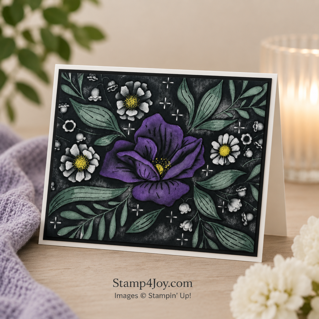
Have you taken a look at the Floral Spray 3D Embossing Folder yet?  It creates such a dramatic background with surprisingly little effort.

This card started with the embossed panel cut slightly smaller than the card base.  Instead of working on the raised side, I flipped the panel over and colored the recessed side of the design first.  A few soft shades of Stampin’ Blends were added to the flowers and leaves.  I used Lemon Lolly, Lost Lagoon, and Highland Heather to bring in some bold color before adding black ink over the top.

Floral Spray 3D Embossing Folder Card Idea - Stamp4Joy.com
How the Black Ink Changes the Look

Once the coloring was finished, I gently blended black ink across the entire panel using circular motions, reapplying the ink many times to get the bold background.  That single step completely changed the feel of the card.  The bold colors underneath still peek through, but the black ink gives everything a rich, moody look.  It ends up feeling elegant and dramatic without needing a lot of layers or embellishments.

After the ink blending I attached the embossed panel directly to the card base.

A Card with a Personal Meaning

This card is heading to a family member who has been dealing with serious health issues.  Thankfully, she recently received a transplant and seems to be doing well.  I wanted to send something encouraging and thoughtful while keeping the design calm and elegant.

The sentiment came from the Greetings for All Mix & Match Ephemera Pack, which made finishing the card quick and easy.  Sometimes it’s nice to skip the embossing and fussy cutting and simply focus on putting the card together.

Why This Technique Is So Fun to Try

One of my favorite things about this technique is that every version turns out a little differently.  The amount of ink, the colors underneath, and even the pressure of blending all change the final result.  It can definitely leave you with a few inky fingers along the way, but I think it’s worth it.

This is one of those techniques that’s fun to experiment with because you never quite know how it will turn out until the final layer goes on.  And honestly, that’s part of the fun.

What colors would you use on your card?

Here's another fun technique you can try.

New Stampin’ Up! Catalog Day and Join Special

New Stampin’ Up! Catalog Day + A Special Join Offer

There’s a lot happening today, and it’s one of those days that feels full of fresh inspiration.  It’s new Stampin’ Up! catalog day, and there’s so much to look through and enjoy.

If you’re anything like me, flipping through a new catalog brings a mix of ideas and possibilities.  It’s hard not to start thinking about what you’d like to try first.

New Stampin' Up! Catalog Day - Stamp4Joy.com
New Catalog Inspiration

The new catalog introduces fresh colors, new products, and creative ideas to explore.  It’s the kind of release that makes you want to sit down and create, even if you only have a little time.

You might find a new favorite stamp set.  Or maybe it’s a paper collection that sparks an idea.  Sometimes it’s just one small detail that gets everything started.

A Join Offer to Take a Look At

Along with the new Stampin’ Up! catalog day there’s also a special join offer right now.

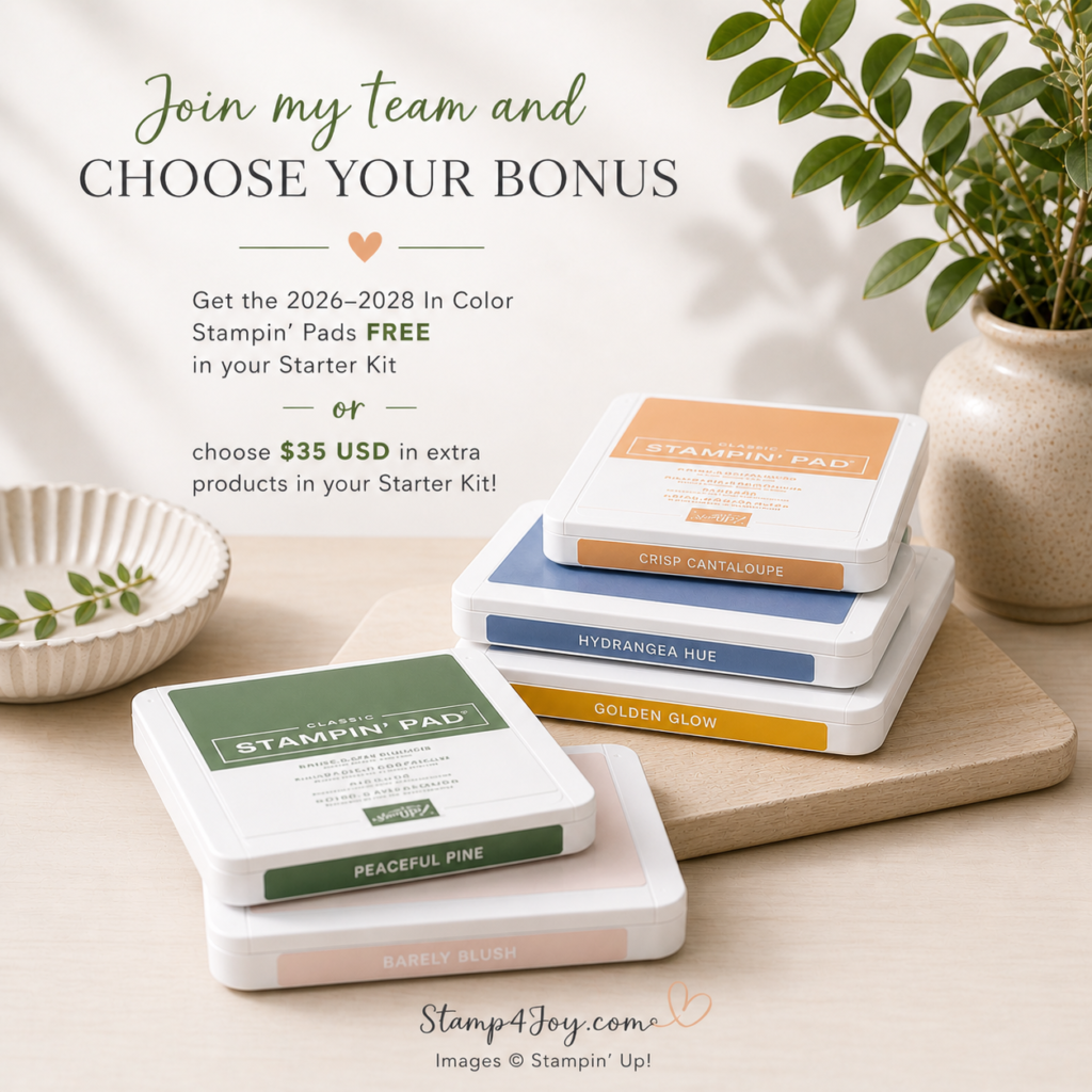
When you join as a demonstrator you’ll receive the new 2026–2028 In Color Stampin’ Pads free as part of your Starter Kit.  If you’d prefer something different you can choose an extra $35 in products instead.  It’s a simple way to start with items you’ll actually use.

What You’ll Enjoy as a Demonstrator

There are also ongoing benefits that come with joining.

You’ll receive a 20–25% discount on products and get early access to new releases and catalogs.  There’s also the ability to earn extra commission, along with access to training and events.

It’s a flexible way to enjoy your crafting a little more — and you can make it exactly what you want it to be.  You can keep it simple and just enjoy the discount or you can explore it a little more.  It’s easy to make your own.

Take a Look When You’re Ready

New Stampin’ Up! catalog day always brings a fresh start.

If you’ve been thinking about trying something new, this might be a good time to take a look and see what catches your eye.

👉 Learn More Here

Virtual Creative Party for Card Makers (Join Me Live!)

Virtual Creative Party for Card Makers

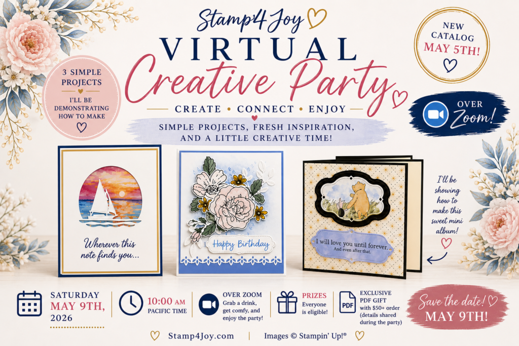
Sometimes you just need a little spark to get back into creating — and that’s exactly what this Virtual Creative Party is all about.

I’m hosting a relaxed, live event where you can simply sit back, watch, and enjoy a bit of creative time.  No pressure.  No prep.  Just ideas and inspiration you can take with you.

Virtual Creative Party - Stamp4Joy.com

If you’ve been wanting to create but haven’t quite gotten started, this is a nice way to ease back in.

What to Expect

During the party I’ll be sharing a few simple project ideas and showing how they come together.  I’ll also be introducing some of the new products from the May–August catalog and the latest Online Exclusives.

This is not a step-by-step class. Instead, it’s more about seeing possibilities, gathering ideas, and enjoying the process.

Here’s what you can look forward to:

  • A few simple project demonstrations
  • Fresh inspiration using new products
  • A relaxed, watch-and-enjoy format
  • A couple of prize drawings
Virtual Creative Party Details
  • Saturday, May 9
  • 10:00–11:00 AM Pacific (1:00-2:00 PM Eastern)
  • Live on Zoom

This event is designed for my customers and fellow hobby crafters.  I’m not able to include Stampin’ Up! demonstrators for this one.

You don’t need to have anything ready or craft along.  Just come as you are and enjoy a little creative break.

You're Invited!

If you’d enjoy a little creative time without any pressure I’d love to have you join me.

It’s simply a chance to relax, watch a few ideas come together, and maybe feel inspired to create something of your own afterward.

Click the link below to register so you can join us live.  I hope you can make it!

Grab Your Spot

Photo Card Ideas with the Capturing Smiles Bundle

Photo card ideas using simple layers and fun details

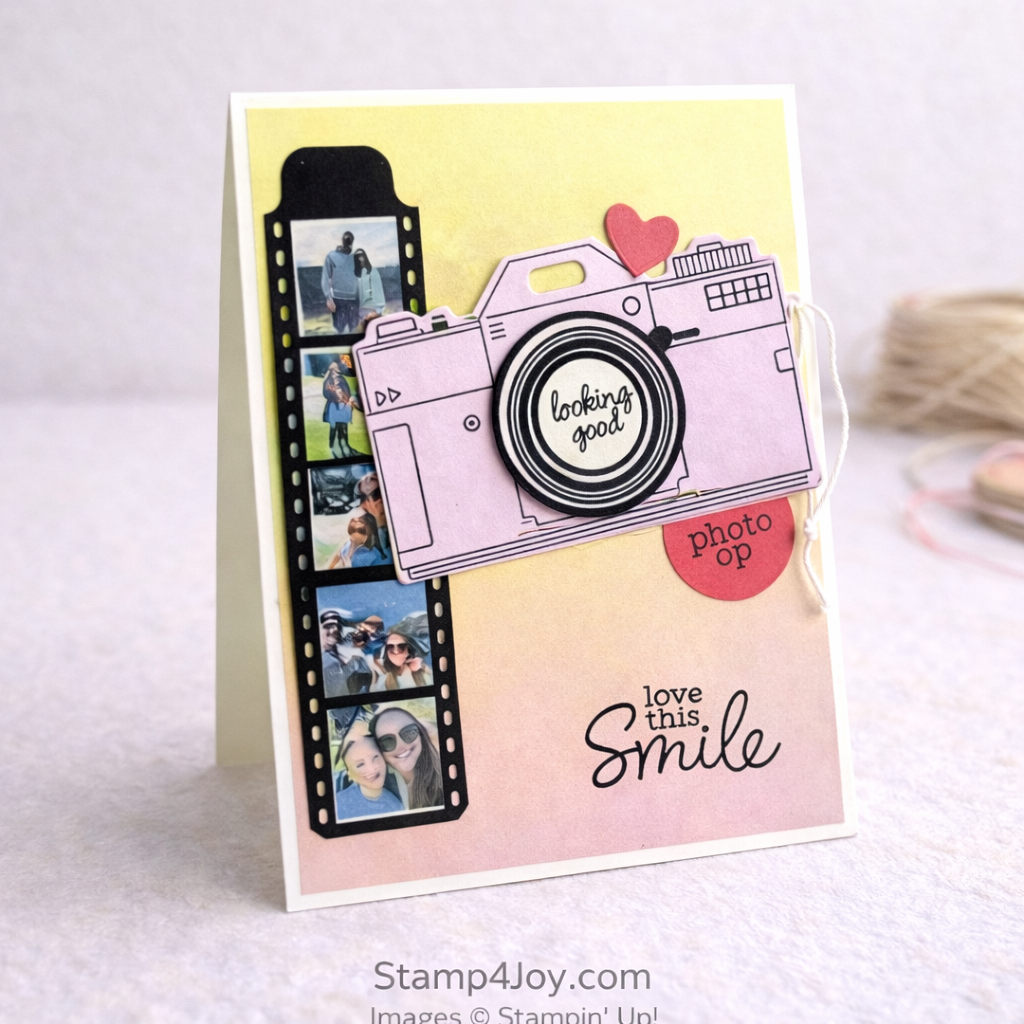
These photo card ideas came together after seeing some adorable vacation pictures from my niece’s family.  I couldn’t resist turning them into something a little more special.

The Capturing Smiles Bundle was perfect for this.  It’s made for moments like these.

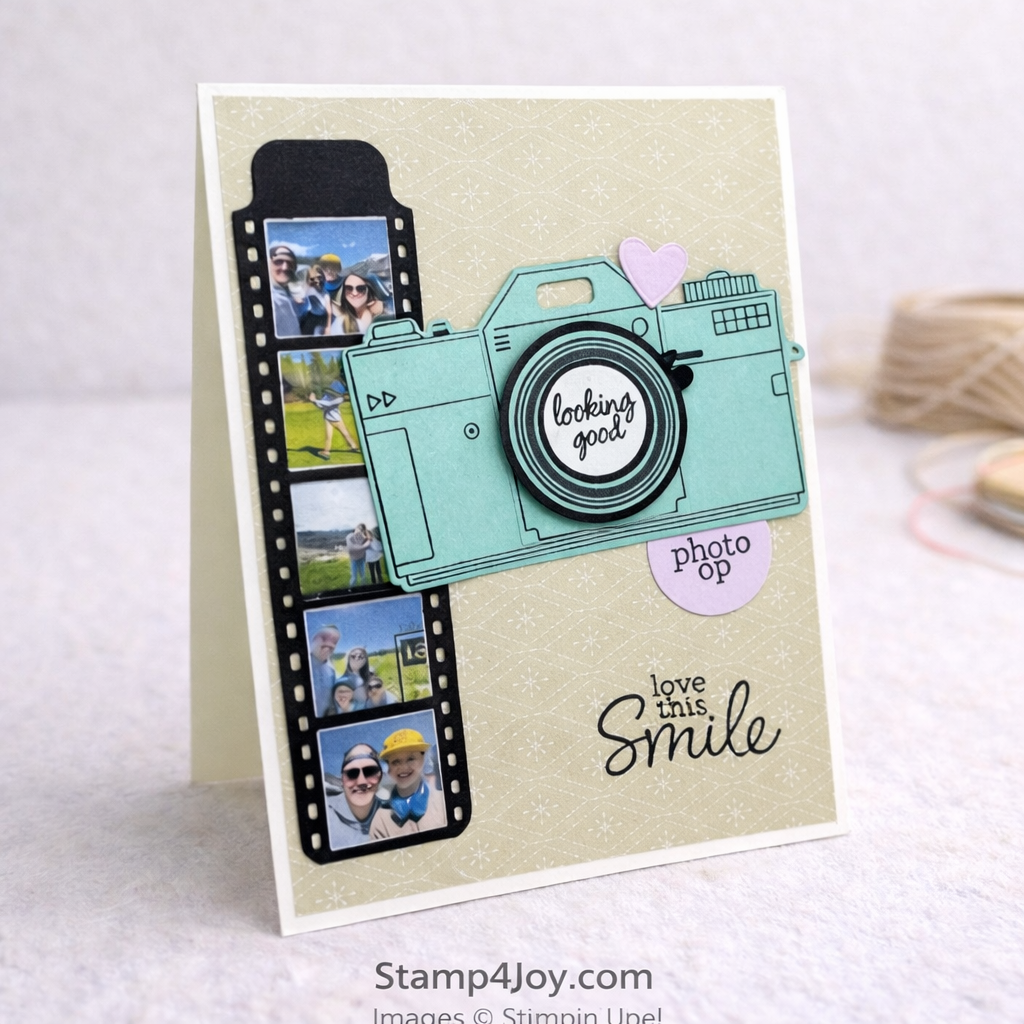
I started by die cutting a couple of the film strips for each card.  I overlapped them slightly so they would fit nicely on the card front, and it worked out just right for five smaller photos.

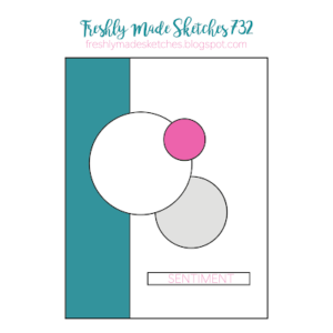
Photo card ideas with a sketch to get started

These cards began with a sketch from Freshly Made Sketches, which gave me a great starting point for arranging everything.  I always love using a sketch when I want a little direction without overthinking it.

If you’d like to try it too, you can check out the sketch by clicking on the image to the right.

From there, I assembled the cameras — hers in Bubble Bath and his in Coastal Cabana.  I added the sentiment “looking good” in the center of the lens, and “photo op” tucked just underneath on the right.

The main sentiment, “love this smile,” felt perfect for these photos.

Everything came together in a way that feels fun and personal, but still simple to put together.

I also created a handmade friendship card using the same bundle, along with the Cutest Crew, which was a fun way to stretch these supplies even further.

Do you ever turn photos into cards, or do you usually keep them for scrapbooking?

Floral Thank You Card with Simple Layers and Texture

Floral thank you card idea with soft layers and texture

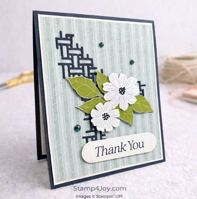
This floral thank you card idea started with a sketch, even though I didn’t end up submitting it in time.  Oh well… it was still fun to work from!

I used Lovely Blossoms Designer Paper for this card, and I love how easy it makes everything coordinate.  The striped pattern on the background actually comes from the reverse side of the paper I used for the flowers.

For the focal point I fussy cut the flowers and leaves from one of the cut-apart sheets.  It’s a simple step, but it really helps create a soft layered look without needing a lot of extra pieces.

Floral thank you card idea details that add interest

Behind the flowers I added a lattice-style die cut using one of the upcoming Lily of the Valley Dies.  I actually cut two and overlapped them slightly to create more texture and depth.

The “Thank You” sentiment comes from the Lovely Arrangements Bundle and was cut using the coordinating die.  I like how the white sentiment ties in with the white flowers and keeps everything feeling clean.

Both the flowers and sentiment were popped up with Stampin’ Dimensionals to give the card a little extra lift.

To finish it off I added a few Secret Sea Flat Pearls for a soft bit of shine.

Looking at it now, I’m wondering if I should have moved the flowers up just a bit… but sometimes it’s nice to leave things as they are.

What do you think — would you have shifted them or left it as is?

Here's a simple birthday card I created using the same bundle.

Card Making Mistakes and How I Fixed Them

When card making mistakes happen… and they will!

Card making mistakes happen to all of us, and this project had a few along the way.

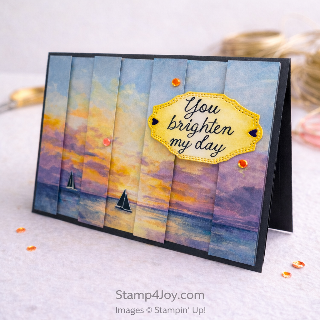
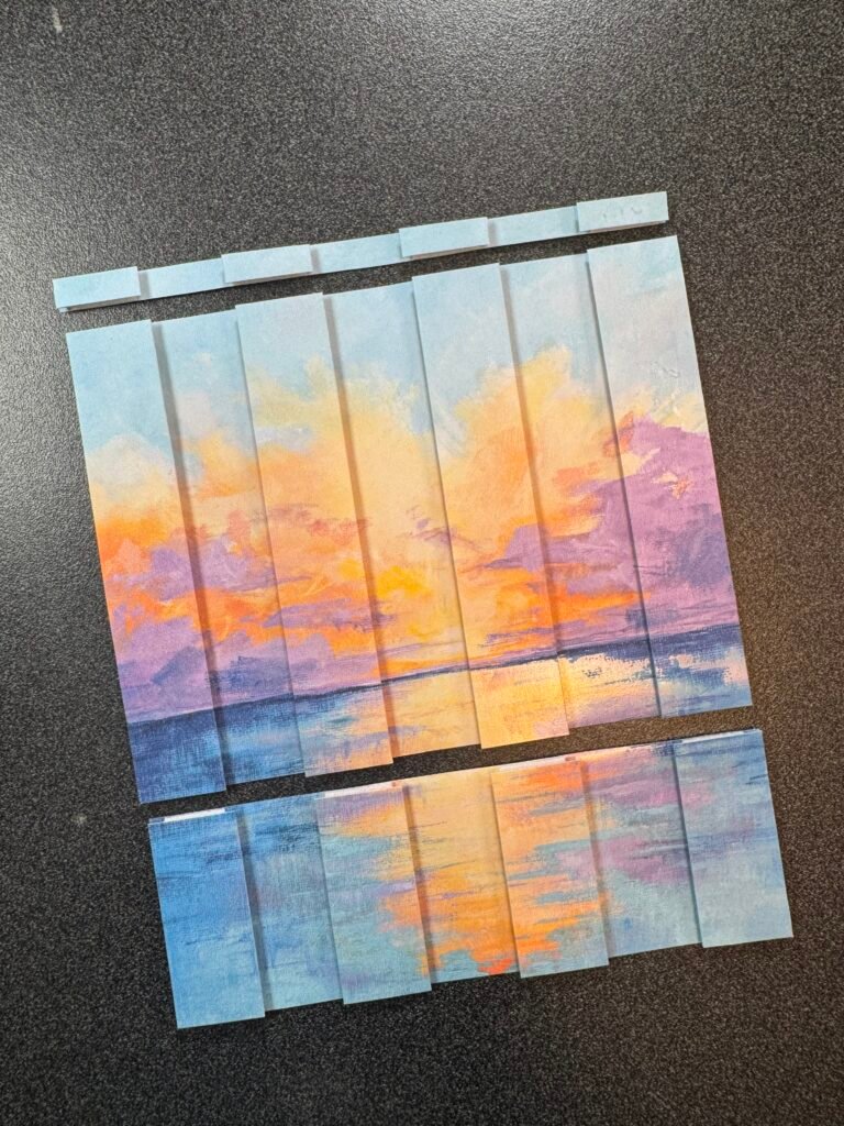
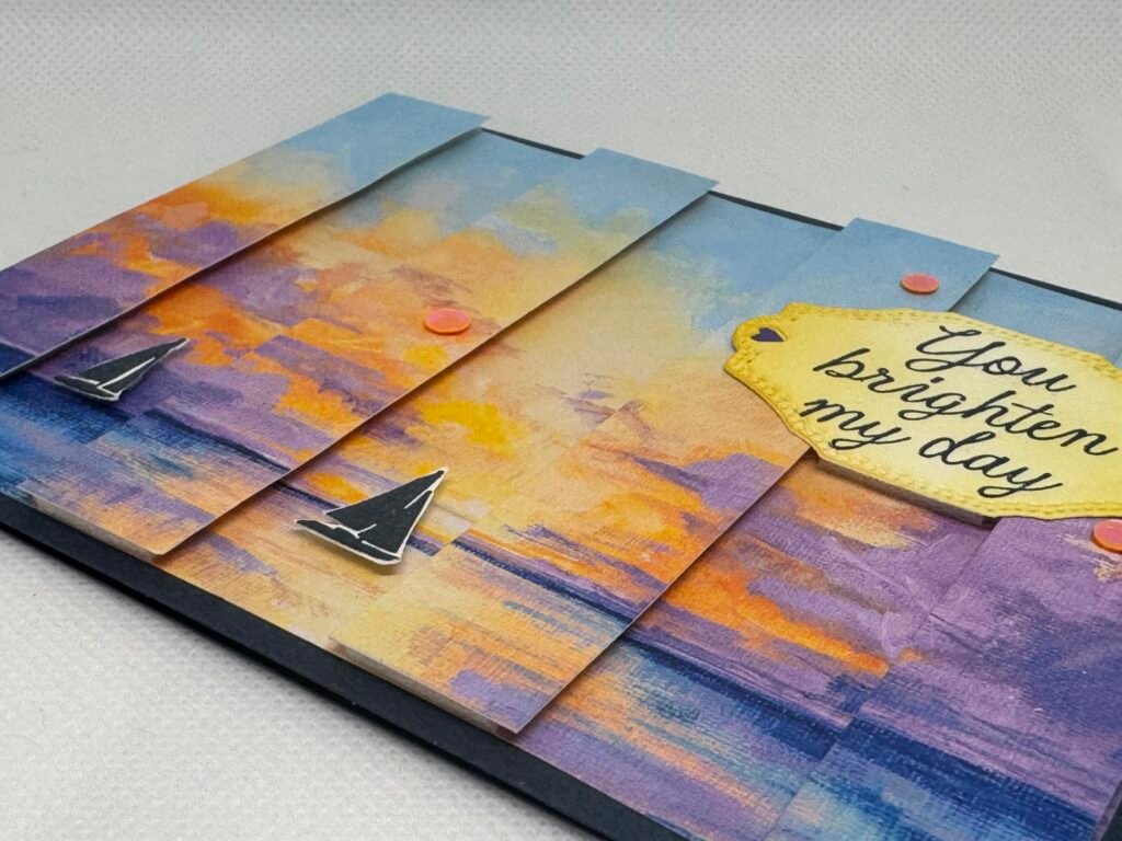
I started with a card making technique where you cut your image into strips and layer them over a full background to create dimension.  It’s such a fun look, and I knew I wanted to try it with this beautiful scene.

I trimmed two matching pieces of 6″ x 6″ designer paper from Scenic Coast to 5-1/4″ wide, then cut one of them into 3/4″ vertical strips.  I used four of those strips for the card front, saving every other one for another project.

Card Making Mistakes - Stamp4Joy.com
Card making mistakes and how I fixed them

Everything was going smoothly… until it wasn’t.

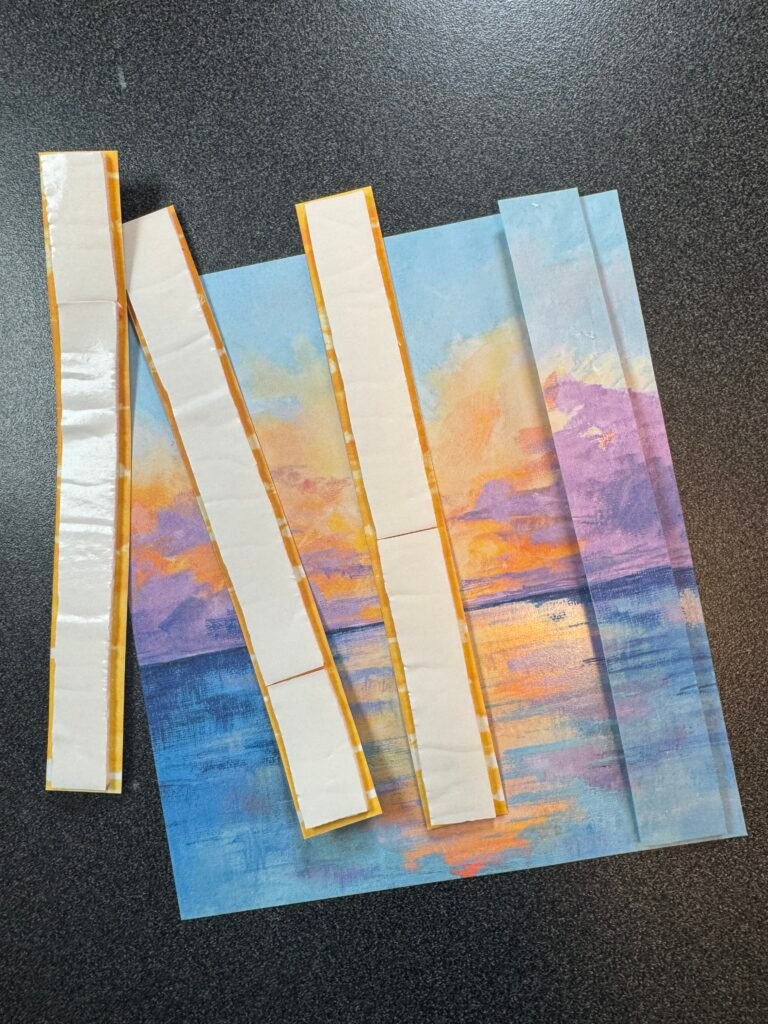
After applying Foam Adhesive Sheets to the last strip I realized I had attached it to the wrong side.  Not ideal.

A little careful “surgery” helped remove most of it, but there was still some sticky foam left near the top.  I used my Embossing Buddy to take away the tackiness, then gently cleaned up the rest with a craft eraser.  Good as new!

Then came mistake number two.

Card Making Mistake Two - Stamp4Joy.com
Attaching the Greeting - Stamp4Joy.com

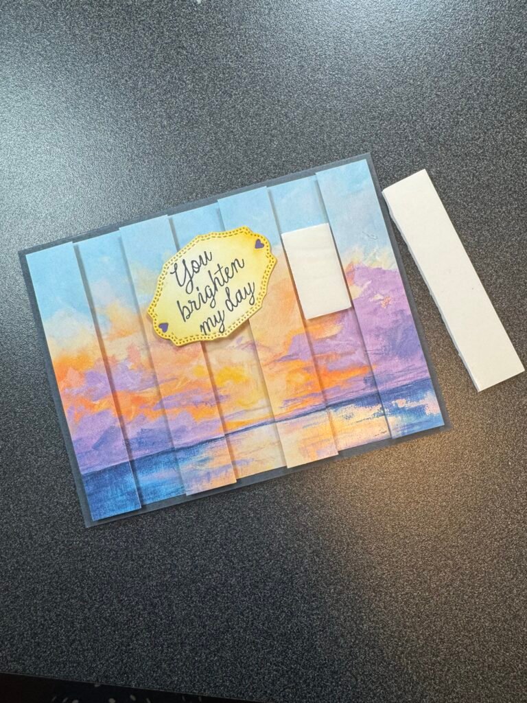
After attaching the strips to the full background (skipping every other space for that dimensional look), I realized the full piece was still 6″ tall instead of 4-1/4″.  Oh, no!

I ended up trimming it down using my Paper Trimmer and finished the cut with my.  Not perfect, but it worked.

From there everything came together nicely.  A couple small strips of Gorgeous Grape Cardstock was placed behind the small hearts on the sentiment so they'd stand out.  Then I added a couple stamped sailboats, a softly blended sentiment label (with Foam Adhesive Strip between two raised areas for it to rest on), and then a few sequins to finish it off.

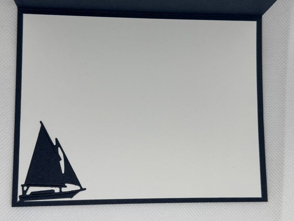
I did have a larger boat die cut that I ended up not using on the card front, so I just glued it inside on the bottom left.

Inside with sailboat - Stamp4Joy.com
Card Making Mistake side closeup - Stamp4Joy.com
Things happen!

This card is a good reminder that card making mistakes are just part of the process — and sometimes they lead to the most interesting results.

Do you usually try to fix mistakes or just start over?  I think I did a pretty good job fixing my mistakes.  I'd love to hear what you think!

Check out this common stamping mistake I've made more times than I care to admit!

Most of these items will be available when the new May-August Catalog goes live May 5th.  Stay tuned!

Handmade Get Well Card Idea with a Lighthearted Touch

Handmade Get Well Card Idea - Stamp4Joy.com

Handmade get well card idea with a lighthearted touch

This handmade get well card idea came from wanting to send something thoughtful, but also a little lighthearted.

Sometimes when someone isn’t feeling well, especially when there are more questions than answers, it can be hard to know what to say.  This get well card was my way of keeping things simple and gentle, while still letting them know I’m thinking of them.

I just can't seem to quit this set!

I keep reaching for this one, and I don’t even think twice about it anymore.  It’s one of those sets that just works, especially when I want something meaningful without a lot of extra fuss.

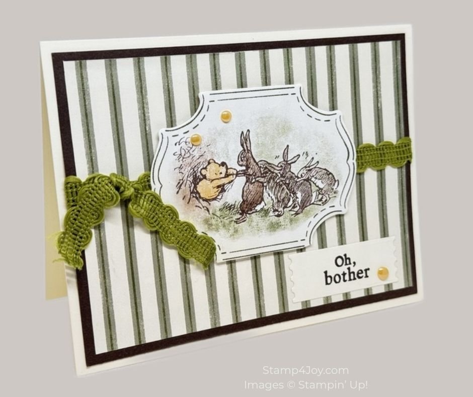
I started with a Very Vanilla card base.  Then I layered on a piece of striped designer paper from the upcoming Silly Old Bear Collection.  I mounted that onto Early Espresso cardstock to give it a bit of definition before attaching it to the card front.  From there I added a strip of Old Olive Specialty Rickrack for a little texture and interest.

Handmade get well card idea details that keep it simple

For the focal point I die cut one of the images from the designer paper.  Pairing it with the sentiment “Oh, bother,” stamped in Early Espresso ink seemed perfect for this get well card.  I used one of the smaller dies from the Perennial Postage Dies to give the sentiment a soft framed look.

For a little extra detail,  without taking away from the card's simplicity, I added a few 2026–2028 In Color Dots.

This handmade get well card idea is a reminder that sometimes a simple card with a gentle message can mean the most.

Do you tend to keep your get well cards lighthearted, or more traditional?

I've been working a lot with this collection lately… I love it!  Here's a handmade love card I made recently with it.