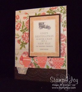
 I love creating vintage greeting cards, but sometimes my “vision” doesn't always translate out well when I actually sit down to design the card.
I had an idea of creating a card reminiscent of grandma's house, complete with vintage wallpaper. I hung a picture with an inspirational saying and added a shelf to hold a lace doily with a few teacups, but I'm not completely happy with the results. Maybe I should have tried a different color for the teacups?
What do you think? Please leave a comment and let me know.


