A Handmade Floral Birthday Card With Bold Blue Accents
A handmade floral birthday card usually leans soft and delicate. This one almost did — until I introduced Blueberry Bushel.
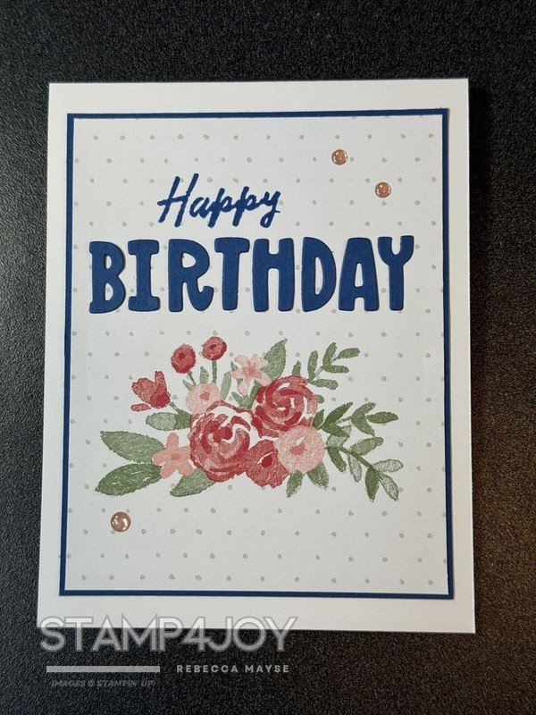
The background features a subtle dotted pattern that keeps things interesting without stealing attention. The watercolor floral image naturally becomes the focal point, and I love how calm it feels at first glance. It’s actually the reverse side of one of the Love Notes Mix & Match Designer Series Paper designs. I had trimmed a strip from one end for another project, and the remaining piece was just too pretty not to use.
Then the blue letters showed up.
I had alphabet dies already cut in Blueberry Bushel from the Seahawks handmade card I created for Super Bowl Sunday. And while they weren’t originally intended for this design, I kept staring at them. Part of me thought the color might be too bold next to the florals. The other part of me thought, “Why not?”
To help the letters feel intentional, I mounted the card front onto a layer of Blueberry Bushel cardstock. That deeper layer grounded the design and tied the sentiment into the overall look.
For the greeting, I masked off part of the “Happy Cake Day” stamp from the Cake Day stamp set (which is now sold out) and stamped just the word “Happy” in Blueberry Bushel ink. It’s simple, but I think it bridges the softness of the florals with the strength of the blue.
A few retired pink dots added just enough movement to finish things off.
I still go back and forth on bold accents with delicate images. Sometimes contrast is what gives a card energy. Other times it can overpower.
So now I’m curious: Does the Blueberry Bushel add life to this handmade floral birthday card or would you tone it down?